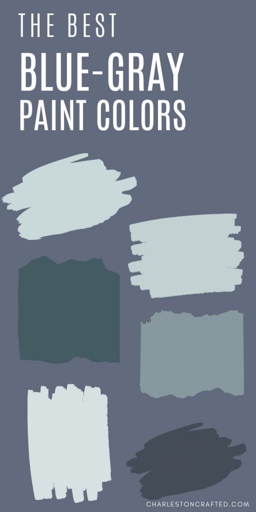
Searching for the perfect blue-gray paint color? These shades are the ultimate way to keep a neutral color palette while still having a little bit of color and personality in your space!
It's no secret that I love decorating with blue. Pretty much our whole house is blue or blue-ish green.
Based on color psychology, the color blue is calming and promotes relaxation. I mean, that's probably how you want your home to feel, right?!
But, even I admit that blue can be a lot for a wall paint color.
Bright, neon blues can be too much for the walls. Even pastel blues can read as super "baby boy nursery 1995" if you aren't careful.
That's why I highly suggest choosing a blue-gray paint color if you like blues!
What is a blue-gray color?
A blue-gray paint color lies somewhere between blue and gray, obviously. However, I think that it is important that the color is more blue than gray.
The gray is used to tone down the brightness of the blue and to make it more calm.
A shade that is more gray than blue would be considered more of a cool toned gray color.
What is grayish blue color called?
These colors are referred to as cool gray colors or blue-gray colors!

Click here to learn my simple step by step process to pick the perfect paint color every time!
What does it mean to have a muted paint color?
The easiest way to make any bright color work better on a walls (or all of the walls in a room) is to select a more muted shade.
You might, for example, find a color that you like on a paint fan deck and instead select a shade on that same strip but 2 shades lighter.
Another way to make a paint color more muted is to pick a color with gray undertones. This will make the color appear more "muddy" and less bold and bright.
These undertones can exist in light or dark colors, but just mean they are more neutral in tone.
A light blue WITHOUT any gray in it could look light a bright -even if pastel - baby blue. This shade is much less on-trend and timeless compared to a more muted, softer shade of blue gray.
Today I have rounded up my favorite blue-gray paint colors for you. The blue gives them a bright, happy shade that is very trendy right now. However, the grey undertones keep them from being too bright.
There are a ton of colors here - but I hope that seeing them next to each other helps to draw attention to the subtle differences between them.
Where can you use a blue gray paint color?
The great thing about blue-gray paint colors is that they are neutral enough to use almost anywhere in your home, but add a pop of interest and color that a more neutral-neutral might not.
I love a blue gray paint color for:
- Main living space - all areas in an open floor plan
- Bedrooms - I go a shade or two darker in bedrooms
- For a spa like bathroom
- Exterior of the house
- Shutters/door when paired with a white exterior
- A piece of furniture in a white or light gray room
- Bathroom or kitchen cabinets (especially an island)
What's the best blue gray paint color for bathrooms?
In general, it's appealing to have a bathroom have a spa-like feeling. Go for a light blue gray. Look for a shade with more blue than gray! Even something with a little green can be nice.
Pair blue-gray walls with crisp white trim and tile for a perfectly spa-like bathroom!
What is the most popular Sherwin Williams blue-gray?
Sherwin Williams Misty is a super easy to decorate with light blue gray color. It's always a great color to start with - though I always suggest swatching 3-5 colors before committing to one! Colors look different in every space.
Click here to get peel and stick paint samples of all of my favorite blue-gray paint colors!
The Best Blue-Gray Paint Colors
Dark Blue-Gray Paint Colors
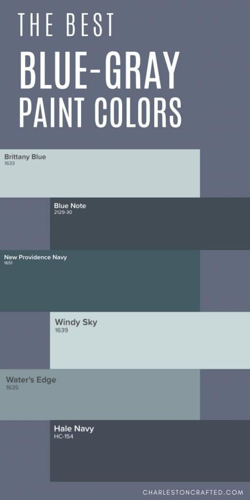
Hale Navy by Benjamin Moore (HC-154)

Hale Navy is a deeply saturated navy blue paint color. Using this color will bring a ton of impact into your space!
It might not be the color for all of the walls in your home, but using it selectively can be really beautiful. The gray undertones keep this blue from looking too much like a military uniform.
Read all about Hale Navy and see it in several different rooms and applications here!
Click here to get a 12"x12" peel and stick sample of Benjamin Moore Hale Navy!
Stained Glass by Benjamin Moore (CSP-685)

Stained Glass is really a dark teal color, but it has been muted by gray undertones. While teal can be really overwhelming to imagine on the walls, the muddiness of Stained Glass makes it really cozy and comfortable, especially in a light and bright space.
Click here to get a 12"x12" peel and stick sample of Benjamin Moore Stained Glass!
Blue Note by Benjamin Moore (2129-30)

Blue Note is a deep navy with an almost sea-like aesthetic. There feels like there are green tones deep within the muted blue. It is a pure, deep blue color, but there are definite gray undertones keeping it from feeling too blue.
Click here to get a 12"x12" peel and stick sample of Benjamin Moore Blue Note!
New Providence Navy by Benjamin Moore (1651)

In contrast, you can see the real teal and green undertones in New Providence Navy.
Click here to get a 12"x12" peel and stick sample of Benjamin Moore New Providence Navy!

Click here to get peel & stick samples of all of my favorite blue-gray paint colors!
Polo Blue by Benjamin Moore (2062-10)

Polo Blue is a rich, masculine, true navy color. It is very dark and moody and will make a big impact in any space. It's also a gorgeous choice for exterior siding for a home.
Click here to get a 12"x12" peel and stick sample of Benjamin Moore Polo Blue!
Gentleman's Gray by Benjamin Moore (2062-20)

Gentleman's gray is really an odd name for this color because it's not nearly as gray as it is a deep teal. However, the gentleman's bit is right on key - this would be gorgeous in a study, library, or man cave paired with masculine accessories.
Click here to get a 12"x12" peel and stick sample of Benjamin Moore Gentleman's Gray!
Medium Tone Blue-Gray Paint Colors
Water's Edge by Benjamin Moore (1635)

Water's Edge has an almost teal undertone. It is a medium darkness and would be beautiful on your walls but would also be stunning for painting a piece of furniture. The teal tones give it a very coastal feel.
Click here to get a 12"x12" peel and stick sample of Benjamin Moore Water's Edge!
Thundercloud by Behr (S520-5)
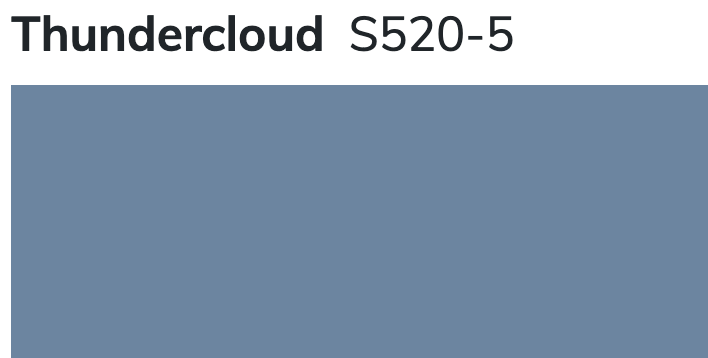
Thundercloud is a medium toned blue shade with almost periwinkle undertones. It has the potential to get bold quickly, but has just enough muddiness to it to keep it from getting out of control.
Distance by Sherwin Williams (SW 6243)
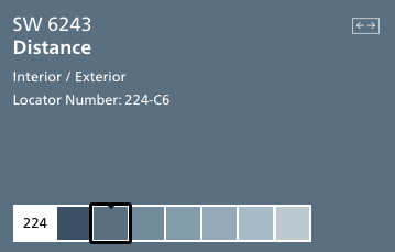
Distance is a shade of blue that makes me think of my favorite pair of broken in denim. It feels warm, welcoming, and inviting.
It's got that perfectly worn look, thanks to the gray undertones. Pair it with metallics to glam it up or keep it rustic with wood tones - it really can work in so many ways.
Click here to get a 12"x12" peel and stick sample of Sherwin Williams Distance!
Aleutian by Sherwin Williams (SW 6241)
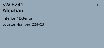
Aleutian is a creamy feeling blue shade. It's darker than a sky blue but not quite periwinkle, and the muddy undertones help it feel muted and restful.
Click here to get a 12"x12" peel and stick sample of Sherwin Williams Aleutian!
Providence Blue by Benjamin Moore (1636)

Providence Blue is a mid-toned blue-green color with muted undertones. It feels almost teal, but not quite green enough.
I think this color would be stunning in a room with a lot of intricate wall moldings. Va-va voom!
Click here to get a 12"x12" peel and stick sample of Benjamin Moore Providence Blue!
Van Courtland Blue by Benjamin Moore (HC 145)

Van Courtland blue has a mixture of green and gray undertones. It feels like the beach and would be stunning on the walls in a master bedroom. I would pair it with crisp whites to really let the color be the star.
Click here to get a 12"x12" peel and stick sample of Benjamin Moore Van Courtland Blue!
Boothbay Gray by Benjamin Moore (HC-165)
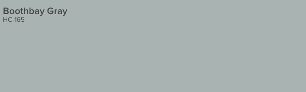
Boothbay Gray is a very muddy, gray color that is heavy on the blue undertones. It feels very clean and welcoming and would work in any space from a kitchen to a living room.
Click here to get a 12"x12" peel and stick sample of Benjamin Moore Boothbay Gray!
Daphne by Sherwin Williams (SW 9151)
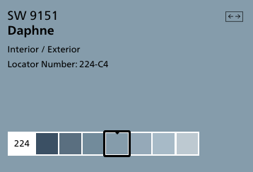
Daphne is a true blue color halfway in between sky blue and navy. It is a really nice shade to be used on anything - a wall, a piece of furniture, or even an accessory. There is so much possibility with this shade!
Click here to get a 12"x12" peel and stick sample of Benjamin Moore Daphne!
Granite Peak by Sherwin Williams (SW 6250)
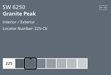
Granite Peak is a deep charcoal gray color with icy blue undertones. This color falls into the bluish gray category. It reads as a really cool gray and can feel more blue depending on it's surroundings.
Click here to get a 12"x12" peel and stick sample of Sherwin Williams Granite Peak!
Bracing Blue by Sherwin Williams (SW 6242)
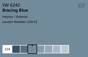
Bracing blue is so charming and is the perfect grayish blue! It is saturated enough that it feels really welcoming and homey, but still has the gray undertones that keep it from overwhelming a space. This is a great way to bring blue into your home!
Click here to get a 12"x12" peel and stick sample of Sherwin Williams Bracing Blue!
Dockside Blue by Sherwin Williams
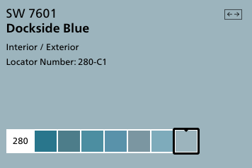
Dockside Blue is a teal color with muddy gray undertones. It is rich and full of color, while still being only medium in darkness. This color is simply gorgeous and looks bluer the more of it you use - so keep that in mind if you plan to paint a whole room.
Click here to get a 12"x12" peel and stick sample of Sherwin Williams Dockside Blue!
Flower Box by Benjamin Moore (CSP-530)

Flower Box is an almost periwinkle blue color. It has gray undertones that keep it from reading too purple. It is medium in tone.
Click here to get a 12"x12" peel and stick sample of Benjamin Moore Flower Box!
Comet by Benjamin Moore (1628)
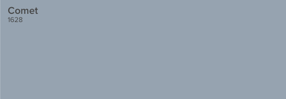
Comet is an icy, dusty shade of gray that might make you think of the solar system. It has blue and violet undertones, making it work well in a variety of types of homes.
It's really the perfect blue-gray combination, with equal levels of each for a balanced look that isn't too blue or too muted.
Click here to get a 12"x12" peel and stick sample of Benjamin Moore Comet!
Bachelor Blue by Benjamin Moore (1629)

Bachelor Blue is a deep, muted blue gray color. It has an elegant feel to it. It pairs well with warm tones as well as other cool colors.
Click here to get a 12"x12" peel and stick sample of Benjamin Moore Bachelor Blue!
Stillwater by Benjamin Moore (1650)

Stillwater is a watery, teal blue color with muddy gray undertones. It is really rich and vibrant and would make a huge impact in your home.
Click here to get a 12"x12" peel and stick sample of Benjamin Moore Stillwater!
Mineral Alloy by Benjamin Moore (1622)
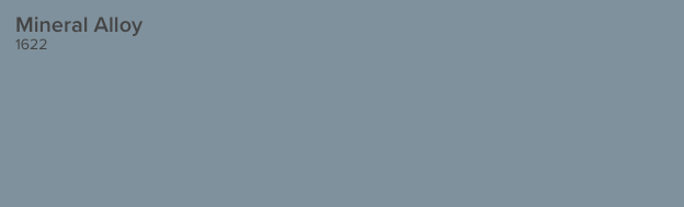
Mineral Alloy is an almost denim blue shade. It's very cheerful and happy but the gray undertones keep it a bit muted.
Click here to get a 12"x12" peel and stick sample of Benjamin Moore Mineral Alloy!
Tranquil Pond by Behr PPU15-7
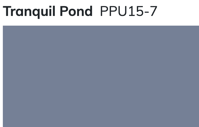
Tranquil Pond is a very purple-y blue gray color. It has a lot of red in it, which gives it that purple look. It's a very traditional color that can read as very blue if you get it on the wall, so be sure to keep that in mind.
Light Blue-Grey Paint Colors
Windy Sky by Benjamin Moore (1639)
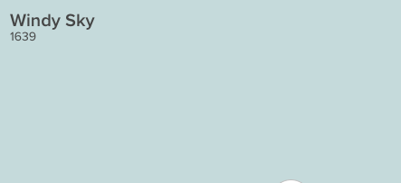
Windy sky is a gorgeous, bright and cheerful blue gray paint color. To me, it feels like aqua, all grown up and sophisticated. It feels like a sunny, cloudless day and would really make your home feel warm and inviting.
Click here to get a 12"x12" peel and stick sample of Benjamin Moore Windy Sky!
Iceberg by Benjamin Moore (2122-50)

Iceberg is a very light blue with strong gray undertones. It is almost a baby blue - but muted up with all that gray so there is nothing pastel about it at all. Iceberg is neutral enough to cover every wall in your entire home and still look interesting.
Click here to get a 12"x12" peel and stick sample of Benjamin Moore Iceberg!
Brittany Blue by Benjamin Moore (1633)
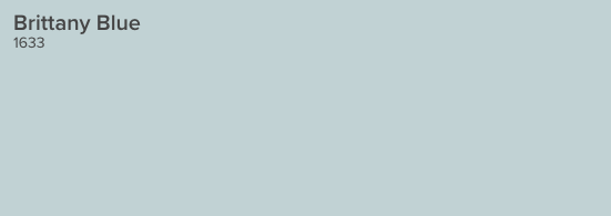
Brittany blue is a light, crisp, cool blue gray color. It has icey undertones but is decidedly blue. It is almost a sky blue, but with those gray tones that keep it from looking too UNC-Chapel Hill.
Click here to get a 12"x12" peel and stick sample of Benjamin Moore Brittany Blue!
Icy by Sherwin Williams (SW6534)
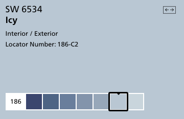
Icy is a very blue color with gray undertones. It is close to a sky blue color and one of the truest blues on this list. Pair it with creamy colors instead of whites or grays to keep it from looking too blue.
Click here to get a 12"x12" peel and stick sample of Sherwin Williams Icy!
Lake Placid by Benjamin Moore (827)

Lake Placid is a bright, purple-y blue color. It is cool and icy while still maintaining a lot of blue pigment. It is a great modern take on baby blue.
Click here to get a 12"x12" peel and stick sample of Benjamin Moore Lake Placid!
Upward by Sherwin Williams (SW 6239)
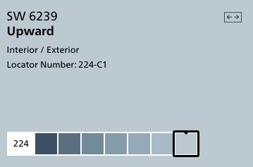
Upward is a clear and pure blue color. It doesn't get muddy tones from the gray undertones but feels less bright because of them. It is a really cheerful color and would work well on walls in many rooms.
Click here to get a 12"x12" peel and stick sample of Sherwin Williams Upward!
Whispering Spring by Benjamin Moore (2136-70)
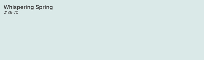
Whispering Spring is a very light and icy blue, but is surprisingly saturated considering it's tone. In otherwise, it's really light but still really blue - and clinging onto those gray undertones so it doesn't feel pastel at all.
Click here to get a 12"x12" peel and stick sample of Benjamin Moore Whispering Spring!
North Star by Sherwin Williams (SW 6246)
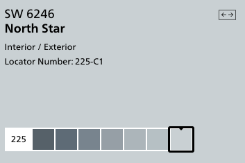
North Star is a cool, crisp bluish gray paint color. It has an icy appearance and pairs very nicely with a more charcoal gray.
Click here to get a 12"x12" peel and stick sample of Sherwin Williams North Star!
Manor Blue by Benjamin Moore (1627)
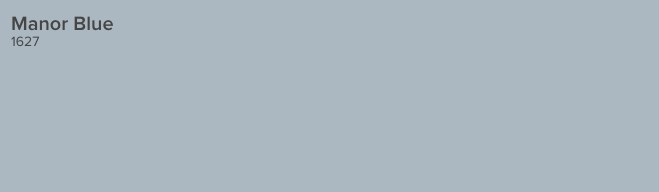
Manor Blue is a mid-tone blue gray with violet undertones. It is a true blue shade, but definitely has gray undertones which give it a moody feeling.
Click here to get a 12"x12" peel and stick sample of Benjamin Moore Manor Blue!
Windy Blue by Sherwin Williams (SW 6240)
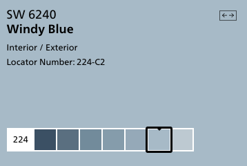
Windy Blue is a light but richly toned blue gray color. It has enough pigment that it really reads as blue, but the tone is muddied enough that it doesn't feel overwhelming at all. This color is stunning in person!
Click here to get a 12"x12" peel and stick sample of Sherwin Williams Windy Blue!
Gentle Gray by Benjamin Moore (1626)

This soft blue-gray is the color of a gentle early morning fog. It is very versatile and pairs well with a wide variety of accent colors.
Click here to get a 12"x12" peel and stick sample of Benjamin Moore Gentle Gray!
Blue-Gray Paint Colors that are Mostly Gray
Online by Sherwin Williams (SW 7072)
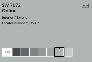
Online is a true gray with cool tones that complement blues very well. It is actually the color that I painted nearly every wall in my house.
I love that it doesn't read beige or tan at all - it is a crisp and clean gray color that plays really well agains blues of all shades.
Click here to get a 12"x12" peel and stick sample of Sherwin Williams Online!
Krypton by Sherwin Williams (SW 6247)
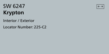
Krypton is a cool and icy blue that is heavily under-toned with gray. Pair it with bright white or charcoal for interest and contrast. This is a neutral gray that can work well with a lot of looks!
Click here to get a 12"x12" peel and stick sample of Sherwin Williams Krypton!
Tranquility by Benjamin Moore (AF-490)
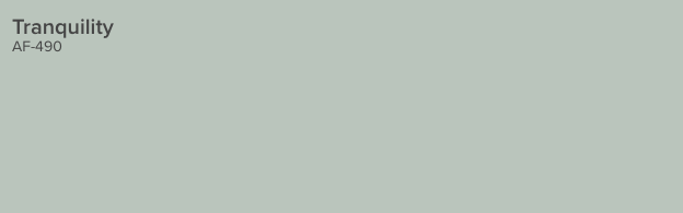
Tranquility is a calm and spa-like gray color with aqua undertones. It makes me think of a boutique hotel and would be very welcoming in your home. It is neutral enough to cover every wall.
Click here to get a 12"x12" peel and stick sample of Benjamin Moore Tranquility!
Misty by Sherwin Williams (SW 6232)
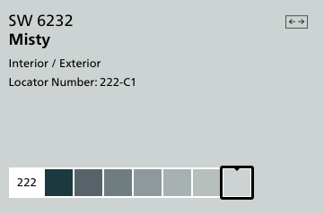
Misty is a grayish blue with a lot of green undertones - you can really see the green if you look at the darker colors on the paint strip. It is very light and bright and easy to work with.
Click here to get a 12"x12" peel and stick sample of Sherwin Williams Misty!
Rock Candy by Sherwin Williams (SW 6231)
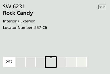
Rock Candy is a pale, almost pastel gray color. It has creamy undertones and makes you feel cool and blue but isn't really blue at all.
Click here to get a 12"x12" peel and stick sample of Sherwin Williams Rock Candy!
Sterling by Benjamin Moore (1591)
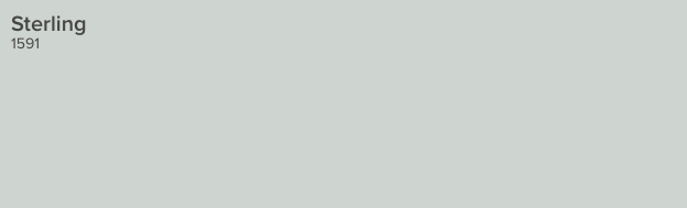
Sterling was modeled after the shade of antique silverware, and its silvery coloring is a reflection of that. The cool undertones give it great blue vibes, though!
Click here to get a 12"x12" peel and stick sample of Benjamin Moore Sterling!
Morning Fog by Sherwin Williams (SW 6255)
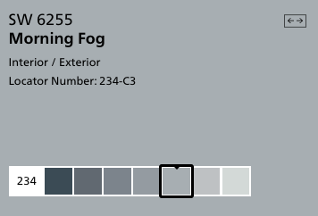
Morning Fog is a cool gray with rich color tone to it. It's very neutral - but it still feels like a vibrant color on it's own.
Click here to get a 12"x12" peel and stick sample of Sherwin Williams Morning Fog!
Click here to get peel & stick samples of all of my favorite blue-gray paint colors!
Frequently asked questions
Where should I use blue gray paint colors?
Blue-grey colors are especially popular for bedrooms because they are calming, cozy, and restful. Many of these colors are even described as "spa-like," making them perfect for your master suite!
What colors complement blue-grays?
For a soothing effect, pair blue-gray paint colors with crisp whites for trim, linens, and other accessories. Creamy beiges are great for carpeting and upholstered furniture. Pops of navy and dark wood tones can help to ground the coloring.
Whatever you do, don't accessorize with too much gray. Blue-gray walls with gray flooring and gray accessories can look a bit 50 shades of gray, and not in a good way!
As you can see, there are tons of gorgeous blue-gray paint colors. You need to decide what look you are going for (how blue, how light or dark) and pick a few to get samples in to try in your home! I hope that you find the perfect shade for your home.
Before you go...
Think you might rather have a neutral paint color? Be sure to check out our favorite whole house paint colors for the best neutrals for a cohesive home color palette!
Get paint samples!
Samplize will send you 12"x12" peel and stick samples of paint colors from many popular brands so you can see exactly how they will look in your home!
Love paint colors? Be sure to check out:
- The Paint Color Formula - my complete guide to picking paint colors!
- My guide to paint sheens
- My guide to paint undertones
Painting for the first time? Check out my video tutorial on the easiest & cleanest way to open a paint can!

Looking for something?
We've been doing this since 2012 so we have a LOT of blog posts!
Search stuff like: Ceiling Projects | DIY Plant Stands | Thrift Flips

Hello, I'm Morgan, half of the creative force behind CharlestonCrafted.com! With a passion for DIY that dates back to 2012, I've transformed three homes and now I'm dedicated to helping others craft their dream spaces. Let's turn your house into a home together!


pam says
Thank you so much. I have been trying to find out if misty is more blue-purple or blue-green in undertones. This is the only place I have found that even mentions its undertones.
Sean says
Glad to help!
lisa b says
Thank you for the information on blue paint colors! I am leaning toward bachelor blue in my bedroom. Would a black headboard/dresser or a alabaster (whitish) headboard /dresser look better with this color? Thank you so much!
Sean says
Depends what your overall vibe is and what style you like to have in your house, but I think that could look very cool!
Cara Dudley says
I used the Windy Blue by Sherwin Williams in my dining room and it is perfect! Just the perfect modern blue grey.
Sean says
I am so glad to hear that, I love that shade!
Lynn says
Thanks for posting these blue paint colors. It's very helpful. I'm wondering if Van Courtland Blue would go well with oak flooring? I've always heard if you have "orangey" oak floors, blue is a good color to pair with them. For some reason Van Courtland Blue grabs my attention.
Morgan says
I think that would look nice! Google search some images of that color with oak floors and it pulls up some nice looking rooms.
Pam says
What do you think of SW Cadet blue for a master bedroom ? i like it but want to make sure it’s not country looking, I’m more modern.
Morgan says
It's a great darker blue-gray color! I hadn't seen it before but did a search and found this color swatch showing some good complimentary colors: https://www.pinterest.com/pin/177681147781456030/
I definitely think it could read modern, especially paired with black and white, bold modern colors! Thanks for reading!!
Mark says
For a black home gym floor, what shade of blue or blue gray would you suggest for the walls and cathedral ceiling (12 feet high at the peak). I am thinking about doing the short side walls in a different color and the ceiling and side walls in the same color. There is no natural light in this room. There will be a large bright blue power rack as the focal point of the gym (12' x 20').
Morgan says
Depends on what you are going for. If you want the walls to pop off the black floor, I'd suggest something lighter. However, if you really want the power rack to show off, you're going to want darker walls. The bright blue wouldn't work as well with a light colored wall. Decide which you want to pop them most- floor or rack.
Christi says
Thank-you so much for this review! I've been trying to decide on a medium blue/gray accent for my kitchen and a darker blue for my dining room. The kitchen is in an open concept with honey oak cabinets and floors and has South windows. The backsplash is brown tones with some gray. The dining room has dark walnut furniture and North facing windows. We're painting the 1st floor City loft, so I'm looking for coordinating colors. I was thinking about SW Gris for the kitchen accent behind the cabinets and SW Grays Harbor for the dining room, but I'm worried it might be too dark as it's a smaller space. Thoughts? You've given me some additional colors to consider. Thank-you!