Navy is an amazing neutral paint color to use in your home! Here are some of the very best classic navy paint colors!
When people say they want to paint something a neutral color, they usually mean white or gray. I challenge you to think beyond that - because navy is a neutral, y'all!
Navy blue is one of my favorite colors to wear and decorate with. It is classic and preppy, can feel nautical or coastla, but also is very traditional.
Many people are scared to choose a dark color for painting a room, thinking that it will make a space feel darker. However, I love a deep dark color for a room like a master bedroom - it just instantly feels cozy and inviting!

How to pick the best navy paint color for your home
There are few things to consider when selecting a paint color for your home.
First is to pick a color family. Congrats - if you are here, it seems like you picked navy blue 🙂
Then, think about colors within that family. Do you want something lighter or darker? Brighter or more muted? What undertones do you want?
Next, you want to get paint samples. I suggest buying at least three paint samples if you want to paint walls. Paint them on your walls in at LEAST three different spots.
You want to make sure you have test spots near anything that is not changing, such as trim, carpet or flooring, or cabinets.
Now, let that dry (do 2 coats if it needs it) and then look at it over the course of at least 2 days. Look at it in morning, day, and evening light. Look at it with the lights on and the lights off.
All of these things effect how a paint color looks in your room!

What can I paint navy?
Here are some things that look beautiful navy:
- A front door
- A piece of furniture
- One accent wall
- All of the walls in a room (with a white ceiling)
- Cabinets in a kitchen or bathroom
- A ceiling
- Molding in a room
- The exterior of a home
- A brick fireplace
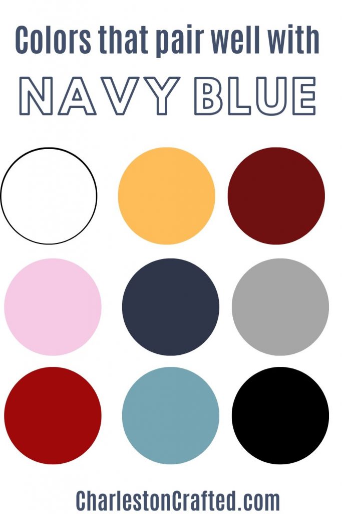
Colors that pair well with navy blue
Navy is really a neutral color, and the best accent colors will vary depending on the exact shade of navy that you select. However, here are some tried and true accent colors that work well with navy:
- Blush pink
- Gold
- Crisp white
- Light blue
- Silvery gray
- Burgundy
- Deep red
- Black
The Best Classic Navy Paint Colors
You will want to test each paint color in your home before going for it fully, but here are some of my favorite navy paint colors.
Naval by Sherwin Williams (SW6244)
Undertones: gray
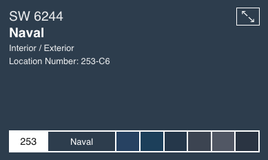
This shade is a total classic - but it is also on trend. It was Sherwin Williams' paint color of the year for 2020.
It is reminiscent of a night sky and is very deep blue. The blue itself is a bit muted so it doesn't read as overly blue, but has gray undertones.
This shade feels rich and luxurious, almost like velvet on the walls. It looks especially beautiful on walls with detailed moldings - paint the walls, molding and all for the best results.
This shade works well in traditional or nautical home styles.
Click here to get a 12"x12" peel and stick sample of Naval.
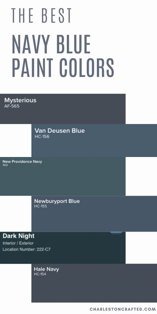
Newburyport Blue by Benjamin Moore (HC-155)

Undertones: gray, purple
This shade of blue has a lot more blue in it and can almost read ever so slightly purple in artificial light. It is very rich and cozy.
I love how it looks on the exterior of a home - all of that natural light makes it read like a deep, expensive pair of denim blue jeans.
Click here to get a 12"x12" peel and stick sample of Newburyport Blue.
Hague Blue by Farrow & Ball (No. 30)
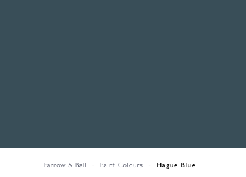
Undertones: green, gray
This shade of navy has a lot of deep green undertones, making it look like the color of the deepest part of the sea. It is almost a very dark, blue-teal shade.
It is very dramatic and almost looks historical. I love how it looks paired with darker wood tones and light crisp white accents.
Click here to get a 12"x12" peel and stick sample of Hague Blue.
Midnight Blue by Behr (N480-7)
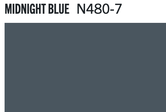
Undertones: gray
Midnight blue is a super gray navy blue paint color. It is very muted - tons of gray undertones - which makes it read very neutral.
If you are afraid of a color looking too primary blue, this is a really safe bet for a deep toned neutral navy.
Gentleman's Gray by Benjamin Moore (2062-20)

Undertones: teal, green
Officially, this blue is inspired by classic navy tailored suits and peacoats. It is formal and masculine by design. With definite teal/green undertones, it's a great option for many spaces.
To me, Gentleman’s Gray is really an odd name for this color because it’s not nearly as gray as it is a deep teal. However, the gentleman’s bit is right on key – this would be gorgeous in a study, library, or man cave paired with masculine accessories.
Click here to get a 12"x12" peel and stick sample of Gentleman's Gray.
Old Navy - Benjamin Moore (2063-10)

Undertones: true blue, slight deep purple
This is a very traditional shade of navy. It is highly pigmented and reads as very blue while still being dark and deep in tone.
It is very saturated with true blue but can read as almost purple in the wrong artificial light. This is a great choice for bold navy and white stripes!
Click here to get a 12"x12" peel and stick sample of Old Navy.
Dark Night by Sherwin Williams (SW 6237)
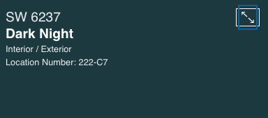
Undertones: teal, green
Dark Night is a very deep teal color. It has a lot of green undertones and is really a mix between rich emerald green and navy blue. I think it is really stunning and interesting.
For this color, pick a room with really good natural light so that the true color can really shine. It's very moody and I think it would make a great color for a kitchen island cabinet!
Click here to get a 12"x12" peel and stick sample of Dark Night.
Hale Navy by Benjamin Moore (HC-154)
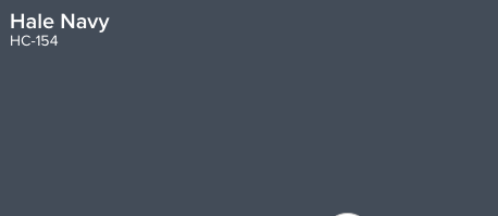
Undertones: gray
Hale Navy is probably one of the most popular navy blue paint colors! It is deeply saturated with slight gray undertones to help mute it just enough.
Hale Navy is a deeply saturated navy blue. Using this color will bring a ton of impact into your space! It might not be the color for all of the walls in your home, but using it selectively can be really beautiful. The gray undertones keep this blue from looking too much like a military uniform.
Click here to get a 12"x12" peel and stick sample of Hale Navy.
Salty Dog by Sherwin Williams (SW-9177)

Undertones: teal
If you are looking for a deep blue color that is highly pigmented, this is a great option for you. There is nothing muted about Salty Dog - it is blue and it is proud of it!
The color does read as slightly teal due to the green undertones, so keep that in mind. This is great for a bold pop of deep color on a spot like a front door or piece of furniture!
Click here to get a 12"x12" peel and stick sample of Salty Dog.
Charcoal Blue by Sherwin Williams (SW 2739)
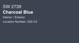
Undertones: gray
Charcoal blue is a really good name for this paint color - it is a cross between a deep charcoal gray and a navy blue. It is a great choice if you cannot decide between painting something dark gray and navy!
Click here to get a 12"x12" peel and stick sample of Charcoal Blue.
Van Deusen Blue by Benjamin Moore (HC 156)

Undertones: gray
This is a slightly lighter shade that still reads as very navy blue. It is labelled a historical color and has slightly muted, gray undertones.
In some light, this color can read as a very dark navy, while in others it is more of a medium toned blue. This is a great option if you don't want to commit to anything too dark, but be sure to test it in your home at various times of day to verify how it will read in your space.
Click here to get a 12"x12" peel and stick sample of Van Deusen Blue.
Club Navy by Ralph Lauren (RLTH228)
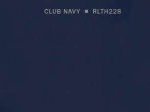
Undertones: purple
This navy blue is preppy and classic. It is highly pigmented - nothing muted about it. It is very very blue but it could read almost purple in certain light. A great option if you love color.
Newburg Green by Benjamin Moore (HC-158)

Undertones: green, gray
This is a beautiful muted dark teal color. It is more blue than green, but still has a lot of green in it. It reads as a very rich jewel tone. The gray undertones help to keep it from feeling too colorful or saturated.
Click here to get a 12"x12" peel and stick sample of Newburg Green.
Deep Royal by Benjamin Moore (2061-10)

Undertones: gray
This is a very dark navy blue. It is a true blue and definitely reads as blue on a wall. It has a little bit of gray undertones, but is not super muted - if you use this color, there will be no mistaking that your paint is blue.
Click here to get a 12"x12" peel and stick sample of Deep Royal.
Evening Sky by Benjamin Moore (833)

Undertones: purple, gray
This shade of navy blue paint definitely has purple undertones to it. It can read like a lighter shade of navy, especially in bright natural light.
This is a great option if you want a highly pigmented navy blue paint color that is not super duper dark.
Click here to get a 12"x12" peel and stick sample of Evening Sky.
Mysterious by Benjamin Moore (AF-565)

Undertones: gray
Mysterious is a navy blue color, but it is very closely related to a charcoal gray. The color is very rich, but also muted. The less light this color gets, the more gray it will look.
Click here to get a 12"x12" peel and stick sample of Mysterious.
Stormy Sky by Benjamin Moore (1616)

Undertones: gray
OK - so I know that this paint swatch looks entirely gray, but hear me out. This is a navy blue color. It's very very gray, but when you get it on your walls in the light, you can see the blue.
It might really be a gray with a lot of blue undertones. But regardless, if you want a charcoal-navy blue paint color, that's not too blue, this is an excellent bet.
Click here to get a 12"x12" peel and stick sample of Stormy Sky.
Looking for more paint inspiration? Be sure to check out my favorite blue gray paint colors, too!
Get paint samples!
Samplize will send you 12"x12" peel and stick samples of paint colors from many popular brands so you can see exactly how they will look in your home!
Love paint colors? Be sure to check out:
- The Paint Color Formula - my complete guide to picking paint colors!
- My guide to paint sheens
- My guide to paint undertones
Painting for the first time? Check out my video tutorial on the easiest & cleanest way to open a paint can!

Looking for something?
We've been doing this since 2012 so we have a LOT of blog posts!
Search stuff like: Ceiling Projects | DIY Plant Stands | Thrift Flips

Hello, I'm Morgan, half of the creative force behind CharlestonCrafted.com! With a passion for DIY that dates back to 2012, I've transformed three homes and now I'm dedicated to helping others craft their dream spaces. Let's turn your house into a home together!