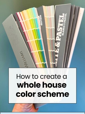
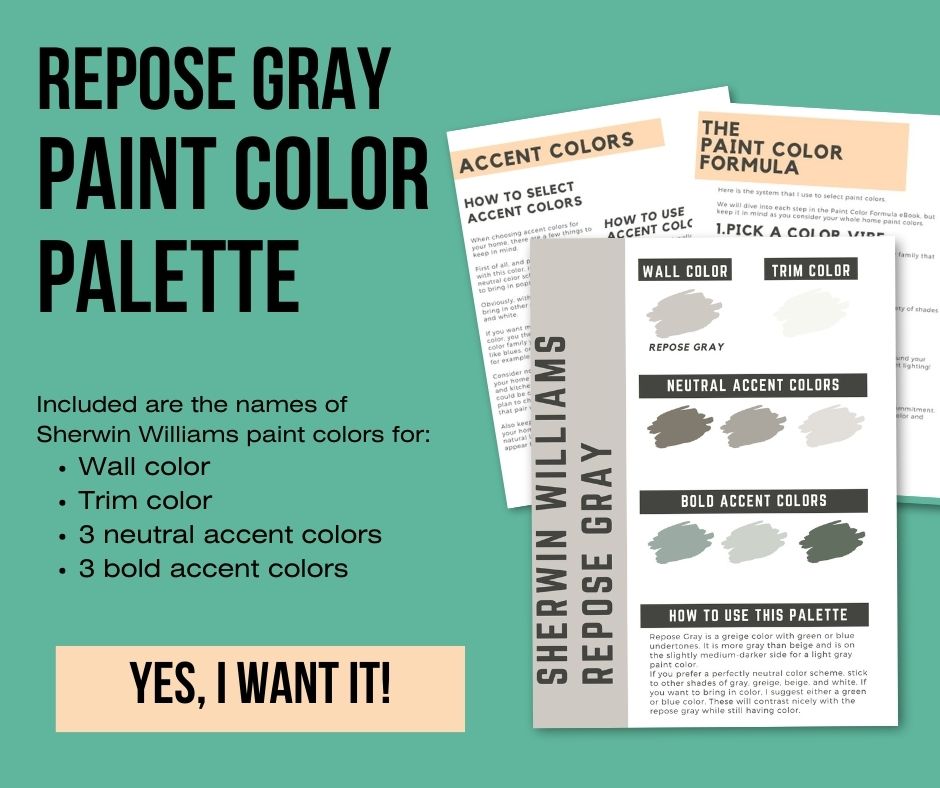
Wondering what colors pair well with Sherwin Williams Repose Gray (SW 7015)? Whether you want a neutral pallet or a pop of color, here are some ideas to get you started!
Repose Gray is an extremely popular paint color. It's a great greige - gray/beige - and a nice neutral that can work in many styles of homes.
So maybe you have painted your room - or even your entire home - Repose Gray. You need to pick some accent colors to keep the space from feeling boring!
Let's talk about the best coordinating colors to pair with Repose Gray!
Be sure to read my whole guide to Agreeable Gray and see it in my home!

How to select your accent colors
When choosing accent colors for your home, there are a few things to keep in mind.
First of all, and probably the biggest with this color, is if you want a neutral color scheme or if you want to bring in pops of color.
Obviously, with neutrals you will bring in other shades of gray, beige, and white.
If you want more of a bold pop of color, you then need to decide what color family you want - cool tones like blues, or warm tones like golds for example.
Consider non-changeable things in your home like trim color, flooring and kitchen cabinets. Sure, they could be changed, but if you don't plan to change them, select colors that pair well with those tones.
Also keep in mind the lighting in your home. If your room gets a lot of natural light, darker colors might appear to be lighter and brighter.
Lighting really effects wall colors and you should look at all colors in daytime and night time to be sure you still like them.
How to use accent colors
Accent colors can be used to paint accent walls or painted furniture.
They can also be used for curtains, rugs, pillows, or accents like lamps and home decor.
How to shop for accent colors
When looking for the perfect accent pieces to match your home, try this hack!
Get a paint sample or paint swatch of Repose Gray and stick it in your car or bag.
When you are shopping, you can quickly pull out the sample and compare it to make sure you like how the colors coordinate!
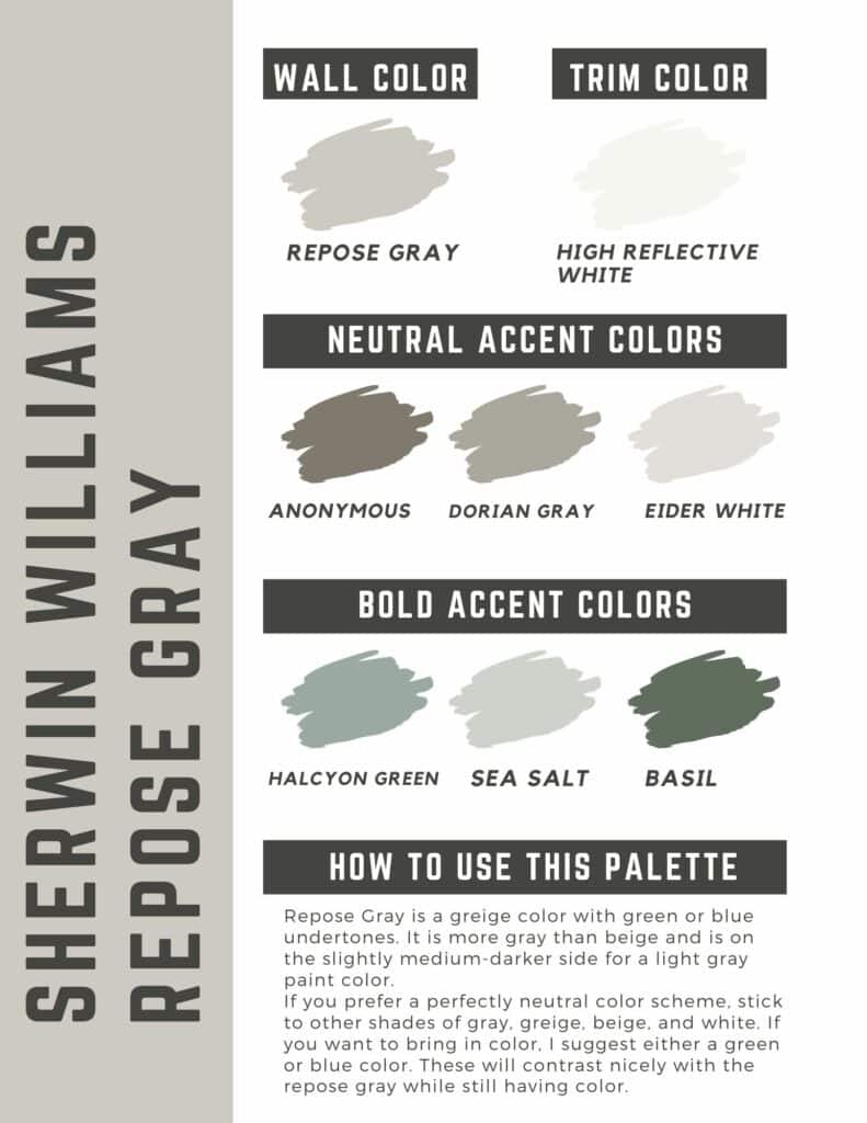
Repose Gray Color Palette
Join the (free!) CharlestonCrafted+ community to access this exclusive color palette!
Sample Repose Gray
Want to try Repose Gray in your home? Samplize will send you a 12"x12" peel and stick sample of this paint color so you can see exactly how it will look in your home!
Click here to get a sample swatch of Repose Gray!
Repose Gray coordinating colors
Repose Gray is a greige color with green or blue undertones. It is more gray than beige and is on the slightly medium-darker side for a light gray paint color.
Here are some colors that work with this great color!
Neutral Repose Gray color schemes
If you prefer a perfectly neutral color scheme, stick to other shades of gray, greige, beige, and white.
What white goes best with Repose Gray?
Stick to warmer white tones for your trim work or accents. I like SW White Dove, High Reflective White, or Cloud White.
Brown paint colors
Brown shades that have a little bit of green to them pair really well with Repose Gray.
If you want to work with a brown paint color, consider:
- SW Anonymous
- SW Dorian Gray
- SW Eider White
Gray paint colors
If you want to pair Repose Gray with another gray color, go with something a little darker.
I like to think if you made a picture of a room black and white - you want accent colors to not "translate" to the same shade of gray.
You want one to be noticeably darker than the other.
Medium-to-dark gray colors that pair well with Repose Gray:
- SW Dovetail
- SW Peppercorn
- SW Black Fox
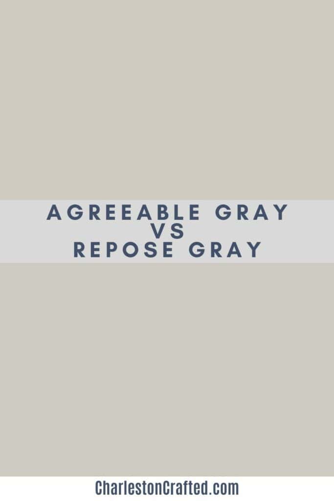
Agreeable Gray
A note on Agreeable Gray - because this comes up all the time.
Agreeable Gray is warmer – with more tan to it – than Repose Gray.
Repose Gray is also ever so slightly darker than Agreeable Gray is. They look very similar until you get them next to each other. If you are in doubt, get samples of both!
Don't pair Repose Gray and Agreeable Gray in the same room. They are so similar it will look like you just got a mis-tint. Go with something with a stark contrast!
See my full comparison of agreeable gray and repose gray!
Accent colors for Repose Gray
If you want to bring in color, I suggest either a green or blue color. These will contrast nicely with the agreeable gray while still having color.
Steer clear of reds and pinks as the undertones tend to clash with the blue green undertones of Agreeable Gray.
Green Accent Colors
If you prefer a green color, consider:
- Halcyon Green
- Sea Salt
- Basil
- Anonymous
Blue Accent Colors
If you prefer a Blue color, consider:
- Luxe Blue
- Moonmist
- Leisure Blue
- Tidewater
What undertone does Sherwin Williams Repose Gray have?
Repose gray has blue or green undertones, giving it a slightly cooler tone than similar greige paint colors. You will especially notice this in a north-facing room, which gets cooler light that brings out the cool undertones.
Is Repose Gray a warm or cool color?
Repose gray is a warm gray color due to the large amount of beige undertones. However, the green undertones keep it from being too warm or tan.
Is Repose Gray more gray or beige?
Repose Gray is more gray than beige, with gray being the main tone and beige being the undertone. It also has blue and green undertones, which play up the gray more than the beige.
Does repose gray go with honey oak cabinets?
The cool and green tones of Repose Gray mean that it does not flow very well with the yellow tones in honey oak cabinets. Go with Agreeable Gray instead.
What color curtains go with repose gray?
With curtains you usually want a bit of contrast, so don't go with greige. Great options are pure white, charcoal gray, or a deep shade of a muted accent color like navy blue, dark teal, dark brown, or dark green.
Is repose grey too dark?
Repose gray looks really light - especially in a large or bright room. It won't look dark unless you are comparing it to white or nearly white colors.
What is a shade darker than repose gray?
Sherwin Williams Mindful Gray SW7016 is one shade darker than Repose Gray and is a great option if you want just a little more color but still a neutral greige.
Why does my repose gray look blue?
All grays have at least a little bit of blue in them. Something in your home's lighting or the surrounding elements is drawing out that blue. Try different lighting or different lightbulbs (with a warmer tint) to see if that helps to cut down on the blue.
What colors do you pair with Repose Gray?
Get paint samples!
Samplize will send you 12"x12" peel and stick samples of paint colors from many popular brands so you can see exactly how they will look in your home!
Love paint colors? Be sure to check out:
- The Paint Color Formula - my complete guide to picking paint colors!
- My guide to paint sheens
- My guide to paint undertones
Painting for the first time? Check out my video tutorial on the easiest & cleanest way to open a paint can!

Looking for something?
We've been doing this since 2012 so we have a LOT of blog posts!
Search stuff like: Ceiling Projects | DIY Plant Stands | Thrift Flips

Hello, I'm Morgan, half of the creative force behind CharlestonCrafted.com! With a passion for DIY that dates back to 2012, I've transformed three homes and now I'm dedicated to helping others craft their dream spaces. Let's turn your house into a home together!