Deciding between Sherwin Williams Agreeable Gray vs Repose Gray? Let’s compare these two super popular greige paint colors!
Agreeable Gray and Repose Gray are two of Sherwin Williams’ most popular neutral gray colors. They’re often used as the primary backdrop in various interior spaces because of their versatile and timeless appeal. Subtle and inoffensive, so you can’t go wrong with either color.
If you look at Agreeable Gray and Repose Gray separately, you’ll notice that they look about the same.
So, let’s place them side-by-side so we can compare and identify the differences and answer the question: Agreeable Gray vs. Repose Gray: Which greige is right for you?
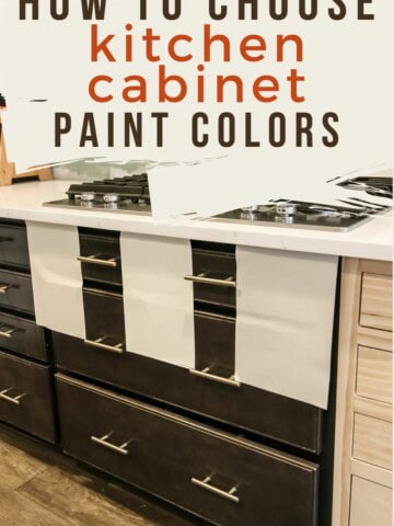
Be sure to read my guide on how to choose paint colors for your home!
Sample These Paint Colors
The best way to decide which paint color is right for you is to sample them in your home. You can pick up samples at your local paint store or the paint desk at any hardware store.
Or, order peel-and-stick samples directly to your home from Samplize!
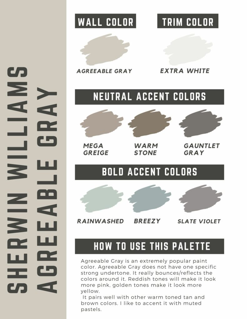
Free printable Agreeable Gray color palette
Join the (free!) CharlestonCrafted+ community to access this exclusive color palette! Once you sign up, you can right click and save the color palette!
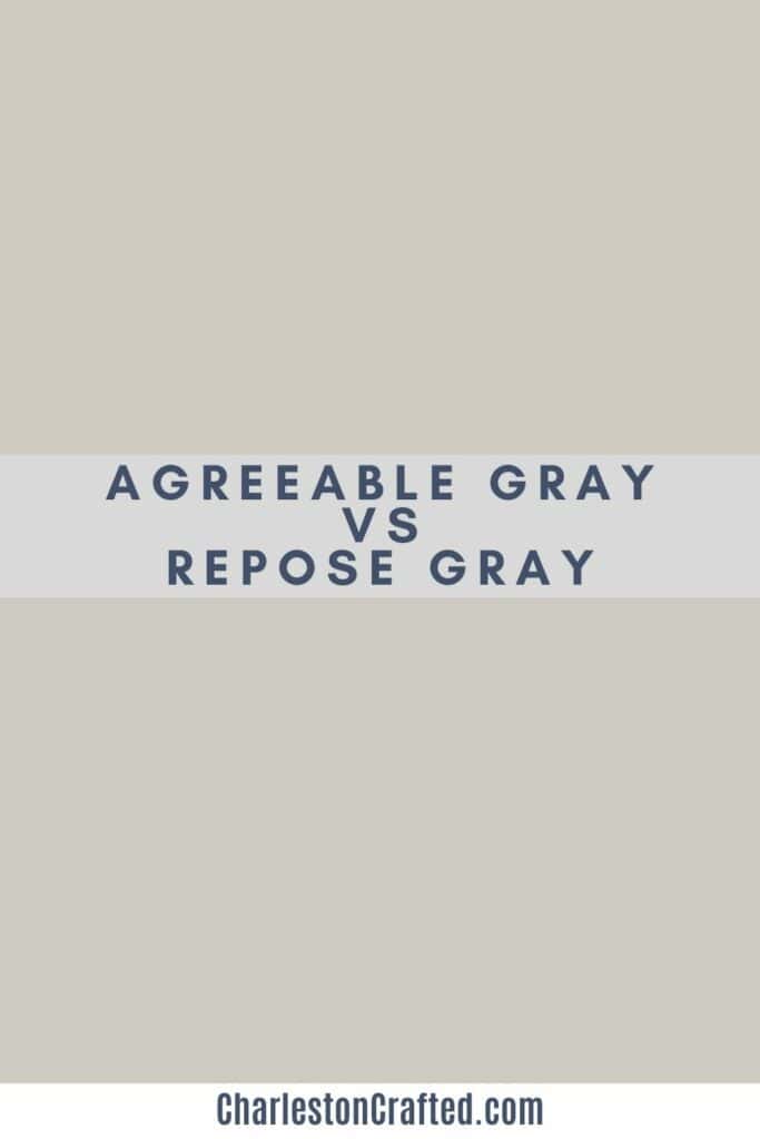
Sherwin Williams Agreeable Gray vs. Repose Gray
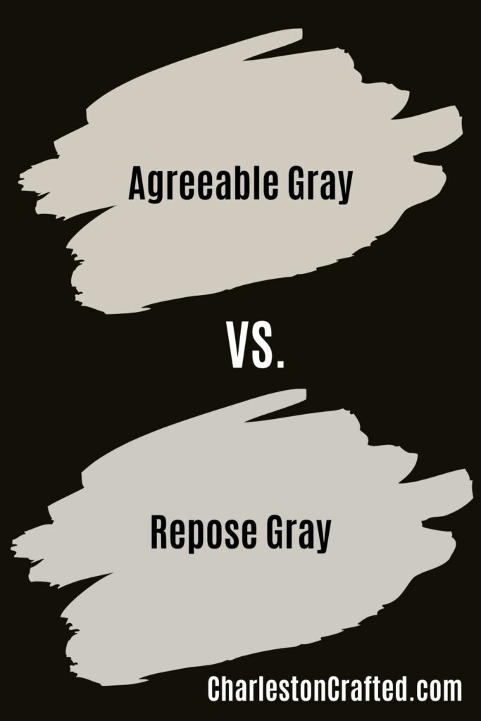
At a glance, Sherwin Williams’s Agreeable Gray and Repose Gray may appear nearly indistinguishable from each other.
But when you place them side-by-side, you’ll notice that Agreeable Gray has a warmer beige tinge to it while Repose Gray has green and slight purple undertones.
Repose gray is also a shade darker than Agreeable Gray, with a Light Reflectance Value (LRV) of 58 as opposed to Agreeable Gray’s LRV of 60. The lower the LRV, the darker the color because they bounce/reflect less light around!

Undertones
Agreeable Gray
This shade is a very warm tan color. It really doesn't have too much undertones in it. My whole home is painted agreeable gray and it seems to really pick up the tones of the colors used around it.
That being said, if I had to nail down Agreeable Gray's undertones I would say that it has slight pink and yellow undertones.
Read my full review of Agreeable Gray and see it in my home!
Repose Gray
Repose Gray has more green and blue undertones. These undertones are especially prominent in north-facing rooms, where natural light is cooler and less direct.
Repose Gray also seems to have more gray than beige compared to Agreeable Gray, which, to me, leans more towards beige.
Coordinating colors
Agreeable Gray
Agreeable Gray pairs well with lots of different color schemes. I mostly use it with bold, saturated colors, but it also pairs nicely with neutral wood tones, whites, and deep neutral blacks.
Avoid pairings with colors that have strong yellow undertones like orange, gold, ochre, and red, as they tend to shift Agreeable Gray towards a more beige and yellow appearance.
Instead, opt for shades that are either lighter or darker in tone, such as pure white, or charcoal gray, or a muted accent color like dark brown, dark teal, or navy blue.
For example, I’d pair Agreeable Gray with a crisp white trim like Sherwin Williams Extra White, and complement it with muted accents like Sherwin Williams Sea Salt, Silver Mist, or Storm Cloud.
For a more comprehensive list of options, check out the article I’ve written about Agreeable Gray’s coordinating colors.
Repose Gray
Repose Grey pairs nicely with a variety of color schemes.
Blues work especially well and, when paired with white, can create a serene and coastal-inspired ambiance.
If you want to lean into the green look, pair it with a cool minty green shade like Sherwin Williams Halcyon Green. Cool greens bring a refreshing touch to a space, preventing it from appearing too warm or tan.
Steer clear of reds and pinks as the undertones tend to clash, creating a jarring and unappealing look to a space.
For trim, pair a Repose Gray wall color with a warmer white like Sherwin Williams White Dove or Cloud White.
Check out all of Repose Gray’s coordinating colors!
Agreeable Gray vs. Repose Gray for Living Rooms and Exteriors
Agreeable Gray and Repose Gray both look stunning in living rooms and exteriors. Choosing between one or the other depends on your preference and the atmosphere you want to create.
If you want your living room or exterior to appear warm and inviting, Agreeable Gray is an excellent choice. Repose Gray leans more toward cooler tones, providing a more modern and sophisticated look.
Agreeable Gray is a touch lighter than Repose Gray, but its warm undertones adapt well to different lighting conditions. Meanwhile, Repose Gray thrives in spaces with ample natural right and may make a room appear smaller if used in smaller or poorly lit spaces.
Is Repose Gray a Greige?
Repose Gray leaning more towards gray than greige, primarily due to its cooler undertones.
However, it can appear greige in certain lighting conditions.
The subtle warmth of its undertones appears especially prominent in dim or cooler lighting.
Repose Gray vs. Worldly Gray
Even when placed next to each other, the difference between Sherwin Williams's Repose Gray and Worldly Gray is so subtle that even professionals can struggle to pinpoint the exact distinctions.
Repose Gray has an LRV of 58, while Worldly Gray has an LRV of 57. This means that the latter is just a touch lighter than the former.
As for the undertones, Repose Gray leans more toward a cool gray while Worldly Gray is warmer with hints of taupe and beige.

Get paint samples!
Samplize will send you 12"x12" peel and stick samples of paint colors from many popular brands so you can see exactly how they will look in your home!
Love paint colors? Be sure to check out:
- The Paint Color Formula - my complete guide to picking paint colors!
- My guide to paint sheens
- My guide to paint undertones
Painting for the first time? Check out my video tutorial on the easiest & cleanest way to open a paint can!
Looking for something?
We've been doing this since 2012 so we have a LOT of blog posts!
Search stuff like: Ceiling Projects | DIY Plant Stands | Thrift Flips


Hello, I'm Morgan, half of the creative force behind CharlestonCrafted.com! With a passion for DIY that dates back to 2012, I've transformed three homes and now I'm dedicated to helping others craft their dream spaces. Let's turn your house into a home together!


