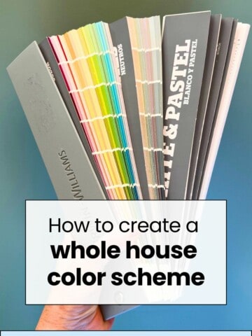
Wondering, how many paint colors should you have in a home? Check out our easy tips and design principles to help you choose just the right number for a harmonious and stylish space!
Designing a home from scratch is one of the most fun things for me to do. There are just so many possibilities!
it's easy to get carried away, especially when looking at inspiration, and pull in a ton of different looks or aesthetics that catch your eye.
If you are in this situation, I challenge you to take a step back and get really intentional. While lots of colors is fun, it doesn't make a space feel cohesive or give it flow.
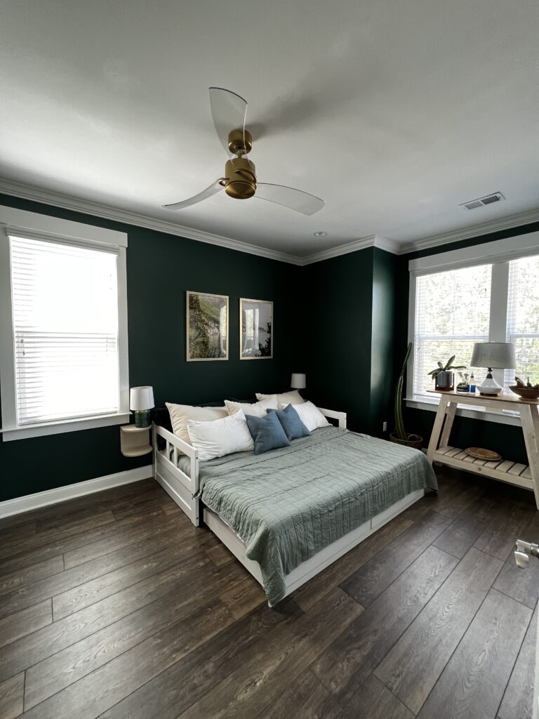
Choosing a more limited and flowing color palette doesn't have to mean boring. 80% of the walls in my home are painted green! But, it doesn't feel wild because the greens flow from space to space and almost feel like a neutral.
This is because I was super intentional in making the colors throughout my home cohesive to achieve balance and flow!
The Role of Color in Home Design
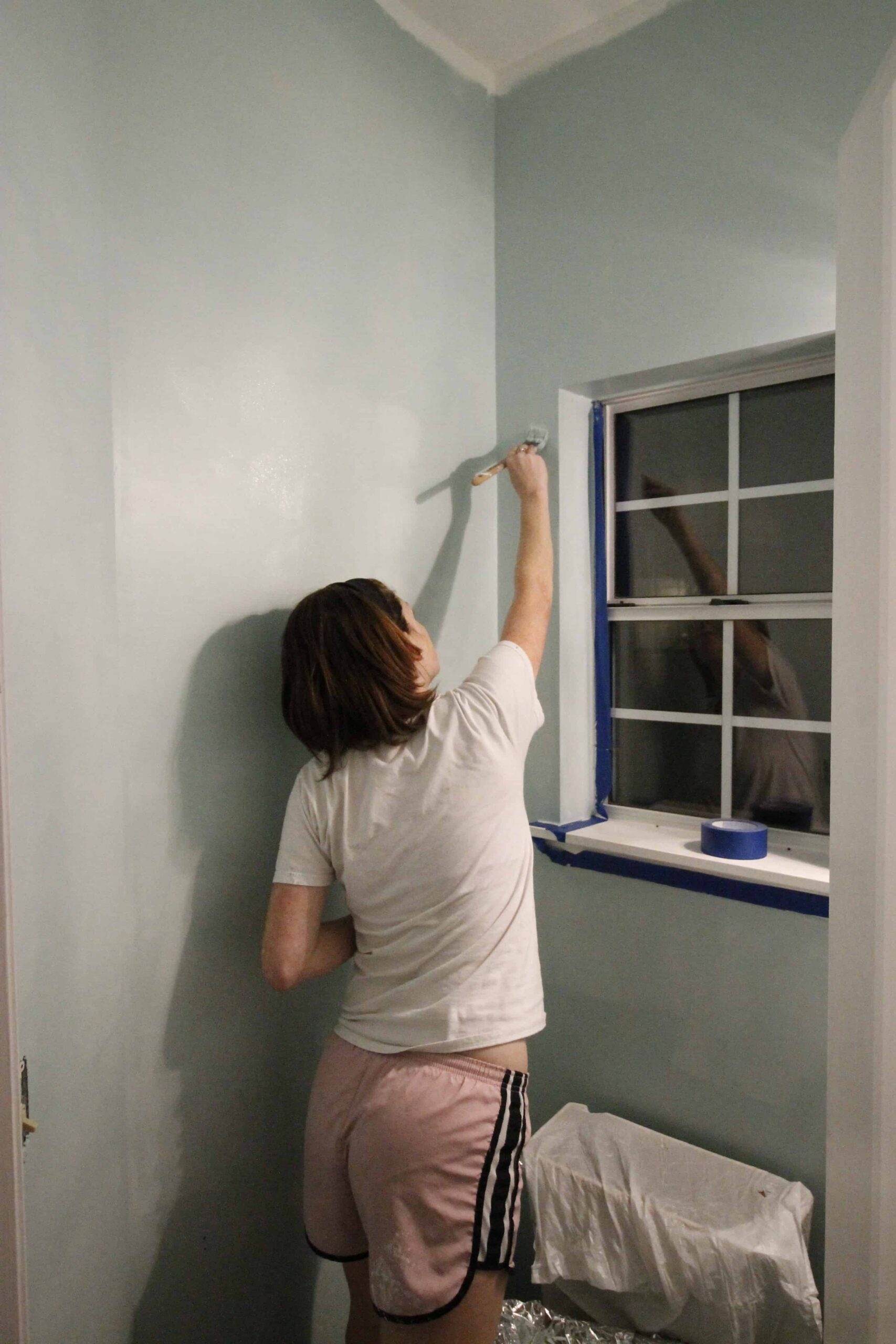
Paint colors are one of the most important elements when redesigning a space. I'm a huge proponent of using paint as the cheapest and easiest way to give a room a totally new lock. It is so easy to paint y'all!
In addition to aesthetics, paint colors have psychological impacts on your space. Cool tones, like blues and icy grays can be relaxing. Warm colors, like beige or yellow, can feel super cozy, and bright colors of any bold tone can make you feel energized and awake.
Finally, colors can affect the perception of your space. If a space feels small and cave-like, painting the walls a light and bright color can instantly open it up. If a space feels cold and sterile, adding a warm wall color can make it feel much cozier. Paint colors are powerful!
Factors to Consider Before Deciding on Colors
There are a few factors that you should think on before picking a paint color:
- Room function: Different colors suit different room functions - such as calming blues for bedrooms or bright colors for play spaces.
- Natural light: Light can be cool or warm toned depending on the direction of your windows or type of light bulbs. And different tones of light can change how a paint color looks in each room - even in the same room throughout the day!
- Existing decor and architectural elements: It's so important to choose color that complement rather than clash your existing finishes. Focus on matching in undertone (warm vs cool) and color family (brights vs pastels vs earth tones etc).
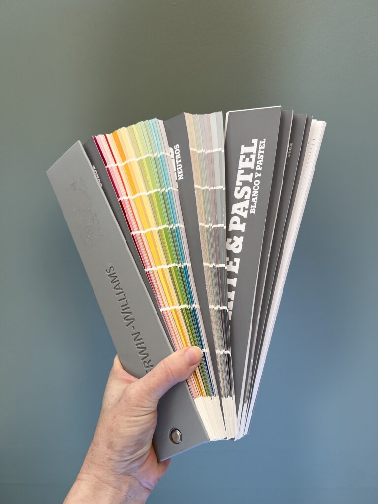
Remember - paint colors come in almost unlimited shades. Don't start with a paint color! Pick a fixture with more limited options - countertops, flooring, even a couch - and match your wall color to that!
Recommended Number of Paint Colors for a home
I recommend having no more than 3 paint colors in any space - max. Any more than that (other than a mural or special installation of course!) will start to feel busy and overwhelming.
There is a concept in art that is called the 60-30-10 rule. This means you want 1 element to be 60% of the space, 1 to be 30% of the space, and 1 to be 10% of the space.
Well, this is called a "rule" it is more of a guideline that can help you, especially if you are feeling unconfident in your decorating.
To apply this to paint colors, you want your one main wall color to be 60% of the space, your top accent color to be 30% of the space, and then you have 10% left over for some thing like trim or other neutral finishes.
When we're thinking about accent colors, that doesn't even have to be a paint color. It might be an accent color, use and decor around the space. Overall, you want to keep the three main colors in each room.
Balancing Colors Throughout the Home
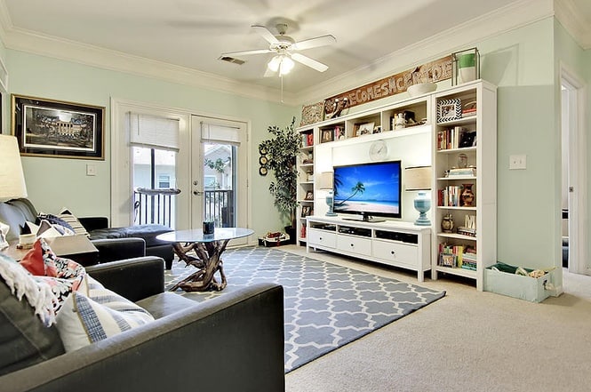
When we bought our first condo, we were so excited to paint. We did a mint green living area, a bright teal bathroom, and a bedroom that was supposed to be gray, but turned out purple. I immediately knew that I had not achieved the aesthetic I was hoping for. This is because my home had zero flow.
If you focus on cohesiveness throughout your home, your space will feel a lot more intentional and designed.

Click here to learn my simple step by step process to pick the perfect paint color every time!
To create cohesive flow between rooms, you want to repeat colors as much as possible. This could mean that your 60% color is the 30% color in an adjoining room, but keeping those same color palettes repeating is the easiest way to make it feel cohesive.
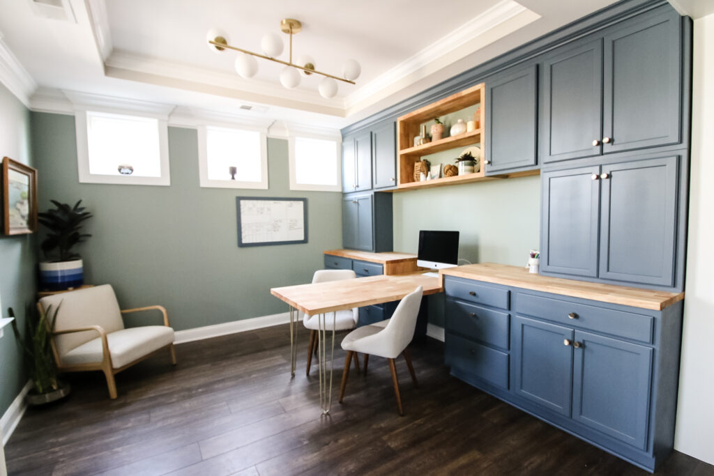
Another way to have your home feel cohesive but still have different colors and different rooms is to go with a monochromatic color scheme. What I mean by that is to pick paint colors that are on the same paint strip but just at least two shades, darker or lighter than each other.
HOT TIP: If you choose colors that are right next to each other sometimes it looks like you just had a missed tent like it. Almost matches, but not quite. It's better to pick some thing that's got a little bit of a significant difference in color depth.
Colors on the same color strip are pretty much guaranteed to look good together and just add a little interest without adding too many colors that would be jarring and stand out in your home.
Choosing Colors in Open Floor Plans
When you're choosing colors for your open floor plan space, it could be overwhelming to pick a color that looks good in all the spaces. My tip is always to start with the trickiest area of the open space.
Usually in an open living space this is the kitchen because your kitchen will have a lot of fixtures you need to match to.
So, pick a wall color that matches all of your kitchen elements and then the sample three similar versions of that color on all of the walls in your open floor plan area.
Pick the shade that looks the best in the various lighting's and elements in those spaces and use it throughout the entire open space.
Choosing Colors for transition spaces
Transition spaces are areas like entryways or hallways that aren't really a room but are separate from other rooms.
I always suggest using a neutral color in your transition space.
The only exception to this would be if it is attached to all doorways that are all painted, the same color - then paint your hallway the same color as all those other rooms to feel cohesive.
If some of the rooms are different shades, you want to pick a neutral that matches each of those colored nicely.
Your hallway or transition space should always be painted lighter or matching in tone to the surrounding rooms.
When to use accent walls
Accent walls can be a fun way to bring in a bold color that might be overwhelming if it was on the walls.
To choose an accent wall paint color, pick a color that is either:
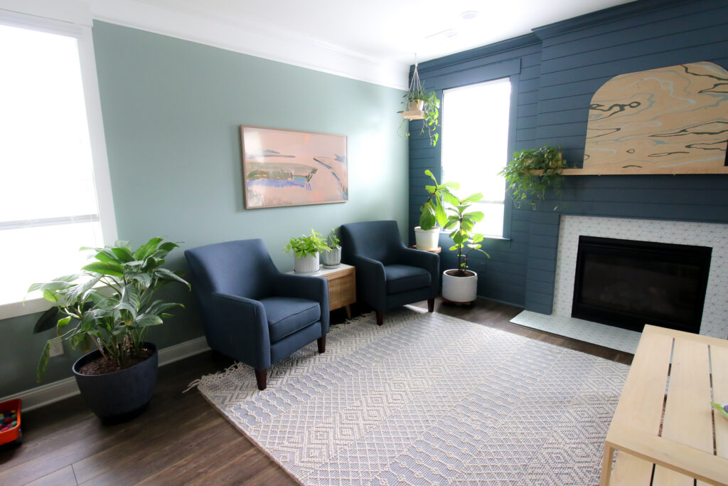
- The same color strip as your wall color but at least 3 shades darker
- A complementary color - opposite on the color wheel
- A tertiary color - just to either side of your wall color on the color wheel
In general, accent walls are usually darker than the other walls around it, not vice versa.
I personally love a mural in a kids space, but you can do a solid color accent wall or a wallpaper wall.
Another fun way to an accent walls to use molding and they painted the same color as the other walls for the molding just gives that wall a little something extra.
Be sure to check out all of my favorite accent wall ideas!
There's no set rule on how many paint colors you should use in your home, but remember – less is more and being cohesive and intentional will make your room feel more like a designer had their hands on it.

Looking for something?
We've been doing this since 2012 so we have a LOT of blog posts!
Search stuff like: Ceiling Projects | DIY Plant Stands | Thrift Flips

Hello, I'm Morgan, half of the creative force behind CharlestonCrafted.com! With a passion for DIY that dates back to 2012, I've transformed three homes and now I'm dedicated to helping others craft their dream spaces. Let's turn your house into a home together!