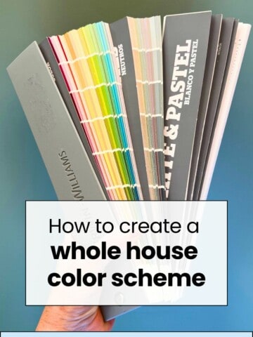
Want to paint a room in your home pink? Bring on the fun! Here's how to pick the perfect pink paint color + some of my favorites in real rooms!
Ever since I started planning Rory's room makeover, I feel like I have really been noticing pink-painted rooms!
Traditionally, pink paint might make you cringe. You might think of pepto bismol, or a princess, or maybe the 1980s.
Well, pink can be cool, pink can be modern, and pink is almost always extremely happy.
Pink is a great option for many homes, and it might be right for you!
How to pick the right pink paint color for your room
There are a lot of shades of pink paint. How do you find the right one?
The answer is to let your room do a lot of the deciding. No color will look exactly the same in any two spaces.
Start by looking on Pinterest for inspiration. Create a board just of pink rooms that you love.
Once you have at least twenty pins in that board, look them over. What do they have in common? What family are they in? See if you can click thru and find out the actual color name.
Now go to your local paint store. Grab the paper paint swatches for as many colors as you can that are in the family or vibe that you determined you like.
Bring them home and tape them or hold them up on your wall. It's important to hold them vertically in the actual space and not just look at them at the hardware store.
Narrow it down to your 2-5 favorites.
Return to the paint store and purchase samples of those colors.
Paint squares of that color - at least 12"x12" - in several places in your room. Be sure to get spots next to things that won't change - like trim, tile, or flooring.
Look at the paint morning, noon, and night. Look with the lights on. Look with the lights off and the blinds open.
Take a picture. Take a picture with a flash.
Which do you prefer? That is your color!
Is pink a good color to paint room?
Heck yes it is! A lot of people are afraid to decorate with pink. They are scared to paint a pink wall and terrified of painting a whole room pink!
However, the right shade can be truly beautiful. It could subtly add just a touch of soft pink to an otherwise beige space.
Or, it can be bold and bright and transform even a small space into a brilliant jewel box.
What room should I paint pink?
You can paint any room pink but here is some advice.
If you are painting a living room, kitchen, or large, open space, go for a lighter blush pink. Something with muted, gray or beige under tones. This will make the space feel light, airy, and bright with just a hint of happy pink.
If you are painting a bedroom, playroom, office, or similar, go with a nice medium toned pink hue. Consider painting a ¾ wall with white on top to brighten it further and draw the eye up.
If you are painting a small space - a powder room, closet, or laundry room - go bold! A deep hot pink or even a mauve
Is pink paint warm or cool?
Typically, pink paint is warm in tone. They usually have red or orange undertones. Warm colors usually make a space feel very cozy and inviting!
Consider going very bold and painting even the ceiling. This is a trick used by interior designers to make small spaces feel actually larger and extra cozy.
What colors work best with pink?
Pink is a great color because it pairs with so many accent colors!
It is easy to pair pink with neutrals: white, black, gray, beige, and chocolate brown all look great.
Pink also pairs nicely with bright colors for a bold look: kelly green, lemon yellow, turquoise, or purple. (in our nursery we paired Coral Fountain with Tower Bridge, which is a turquoise color).
Don't be afraid to layer shades of pink, too. Darker mauves pair really nicely with ballet slipper baby pink!
When choosing complimentary colors for your pink colors, my biggest tip is to pick something at least two shades off. Basically, pair a light pink with dark accents or a dark pink with light accents.
Imagine taking a photo of your room in black and white - you don't want it to all be the same shade of "gray" but instead go for contrast!
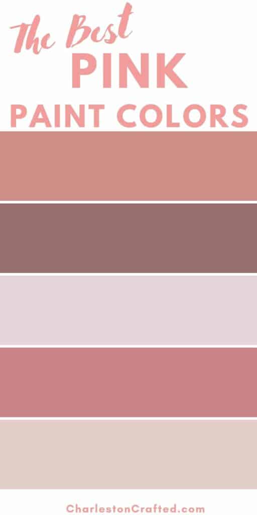
The best pink paint colors
Here are my top picks for light and dark pink paint colors!
Light pink paint colors
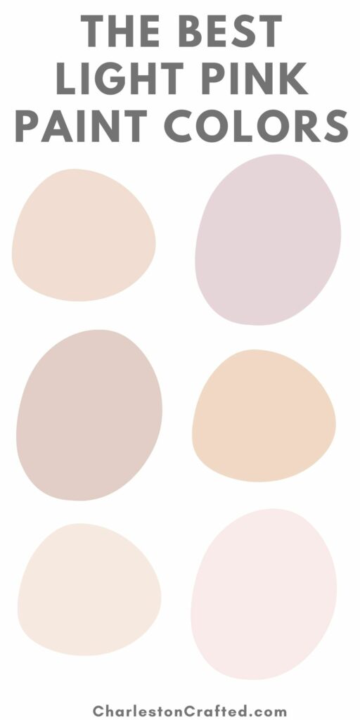
Pale Cherry Blossom by Benjamin Moore (2101-60)

This blush color has a lot of gray undertones to it, making it a very dusty blush. Those gray tones really mute the pink and make it not bright or overwhelming for a space.
If you are looking for a blush pink that is not super light but also not bright, this is a great option!
Click here to get a 12"x12" peel and stick sample of Pale Cherry Blossom!
Sugarcane by Benjamin Moore (1185)

If you are looking for a blush color with a bit of a coral tint, check out Sugar Cane!
This light pink paint color has orange undertones, making it feel very warm and cozy. However, it is still very muted so it doesn't feel bright or "neon" in any way.
It's a great pastel coral color option!
Click here to get a 12"x12" peel and stick sample of Sugar Cane!
Angelic by Sherwin Williams (SW 6602)

This is a brighter, more pigmented blush option. It's pretty true to a classic "baby pink".
There are slight orange, warm undertones, but it definitely doesn't read as coral.
This color looks really good paired with creamy white trim or accents. It's very feminine!
Middleton Pink by Farrow and Ball (No. 245)

This is another great blush pink option. It is brighter than some of the other colors - less muted.
It also has slightly orange/coral undertones. This gives it a warm feeling and could play well when paired with other warm toned accent colors.
Click here to get a 12"x12" peel and stick sample of Middleton Pink.
Fancy Pink by Sherwin Williams (SW 7107)

Fancy Pink is a very light pink blush color. If you want a subtle pink, this could be a great option! It's got a lot less pigment than most of the other light pink colors, so it's a lot less pink.
It also has orange undertones for a warm, coral toned look.
Orleans Violet by Benjamin Moore (1374)

This is a great blush pink that trends slightly violet. That's because it has blue/purple undertones, giving it a bit of a cooler tone.
It looks pretty pink until you put it next to one of the more coral options above, then it looks purple!
This is a great option on the line of pink and purple. It's also got muted tones so it doesn't feel too bright whatsoever.
Click here to get a 12"x12" peel and stick sample of Orleans Violet.
Cosmetic Blush by Sherwin Williams (SW7110)

Cosmetic blush is a light pink paint color with a lot of coral/orange undertones. It's very light and pastel, and a great option if you want a barely-pink color with warm tones.
Queen Anne Pink by Benjamin Moore (HC-60)

If you want a blush pink that is very coral, orange, or almost a peach color, look no further! This is a great muted shade with plenty of pigment so it's not too faint or subtle. Another great option!
Click here to get a 12"x12" peel and stick sample of Queen Anne Pink.
Intimate White by Sherwin Williams (SW 6322)

Intimate White is another great option for a very light pastel pink color. This is a muted color with gray to it so it's not too bright.
It has very warm tones and orange undertones, making it pair really nicely with white, gold, and other warm toned colors.
Click here to get a 12"x12" peel and stick sample of Intimate White.
Touch of Pink by Benjamin Moore (2008-70)

This is a brighter, more true pink pastel pink color option. It's what I would call a ballerina pink and very feminine and sweet!
Click here to get a 12"x12" peel and stick sample of Touch of Pink.
Dark pink paint colors
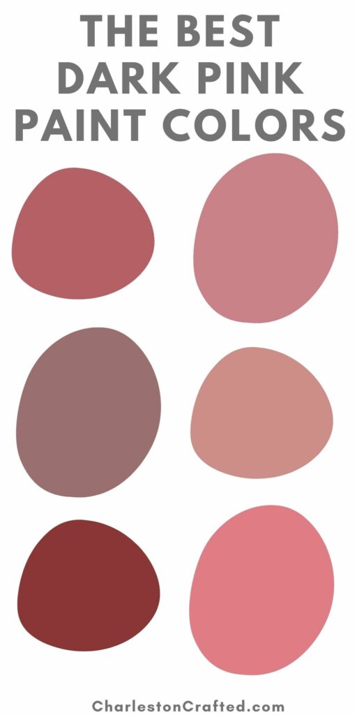
Pressed Flower by Sherwin Williams (SW 6304)

Pressed Flower is a mauve-y pink color with slight purple undertones. It's very rich, but at the same time muted, so its not too dark.
I'd love to see this color painted on all the walls - including the ceiling - in small powder room or on a wall with a lot of intricate trim work!
Click here to get a 12"x12" peel and stick sample of Pressed Flower.
Radicchio by Farrow and Ball (No. 96)

This is a very deep pink color with red and purple undertones. It is extremely pigmented and very dark and solidly red.
This is an excellent and bold choice for a front door, piece of furniture, or kitchen island!
Click here to get a 12"x12" peel and stick sample of Radicchio.
Apple Blossom by Sherwin Williams (SW 0076)

This is more of a medium toned than dark pink. However, it reads as really rich and darker, especially in a smaller, windowless room.
This is what I call a true pink with muted tones, so it won't read as orange or purple and it also won't be overwhelmingly bright! A really great option.
Coral Essence by Benjamin Moore (2007-40)

This is an extremely bold hot pink paint color - but it's a good one!
It definitely has orange/coral undertones to it.
this color works well if you are going for a colorful beachy/tropical vibe. I have also seen it work well in rooms with eclectic styles, such as on a wall with a large gallery wall in a ton of colors.
Click here to get a 12"x12" peel and stick sample of Coral Essence.
Resounding Rose by Sherwin Williams (SW 6318)

This is a better color option if you are looking for a deep coral pink with more muted tones. It's not bright at all because of the gray undertones.
This is a great way to add bold pink color without it being too bright, if you don't want brightness. I think this would be great for a ¾ paint wall.
Click here to get a 12"x12" peel and stick sample of Resounding Rose.
Concerto by Sherwin Williams

This is a very pretty muted plum color. It has a lot of blue/purple undertones, and has a depth and interest to it that I really love! I think that this would be stunning on a wall with a lot of molding or visual interest.
Click here to get a 12"x12" peel and stick sample of Concerto.
Genuine Pink by Benjamin Moore (2005-40)

This is another bright "Barbie pink" paint option. But, it actually does have a lot of gray tones to it so it doesn't feel neon or overly bright, despite being very pigmented.
Click here to get a 12"x12" peel and stick sample of Genuine Pink.
Tender Pink by Benjamin Moore (2090-50)

Tender Pink is another great dark coral color. It's more muted than some of the really bright colors, but not super muted. It could definitely still feel bright, especially if paired with neutrals!
Click here to get a 12"x12" peel and stick sample of Tender Pink.
Deep Mauve by Benjamin Moore (1265)

If you want a deep pink color with a lot of purple undertones, look no further. This is more of a cool toned color and it's almost grape-y.
However, it's still got gray to it so it doesn't feel bright or like a purple dinosaur.
Click here to get a 12"x12" peel and stick sample of Deep Mauve.
Redbud by Sherwin Williams (SW 6312)

This is what I would call lipstick pink. It looks like the color you would choose for a pedicure before a tropical beach vacation.
It's got a lot of red undertones to it, which is what gives it that kissable look. It's not to bright and would be fabulous for a small room or a piece of furniture!
Click here to get a 12"x12" peel and stick sample of Redbud.
Check out some of my favorite pink paint colors in real rooms!
The best pink paint colors for every room
Looking for the perfect pink paint color? Check out some of my favorites in real rooms!
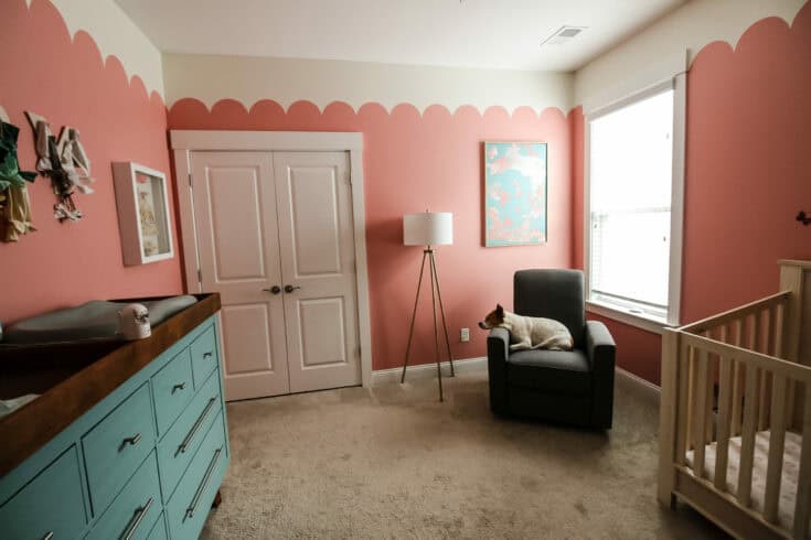
We used coral fountain in our daughter's nursery. It has a bold but not too bright slightly orange warm tone to it!
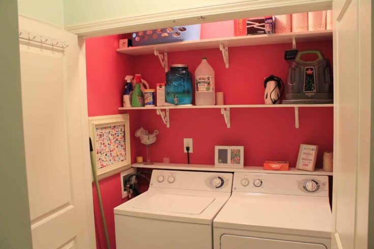
In my very first condo, I painted my laundry room hot pink! This color is not for the faint of heart, but it's great in small spaces when paired with neutrals. It would also be a good option for painting furniture or accessories for a bold pop of hot barbie pink.
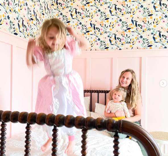
Looking for a lovely blush pink paint color? You'll love Dream Whip, a light and airy pink. How perfect is it paired with this floral wallpaper?!
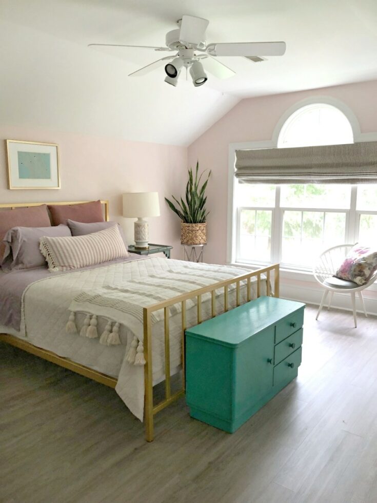
I love the gray undertones of this blush pink color. Its very faintly pink, making it subtle enough to not scare any one off! A great way to ease yourself into a pink room!
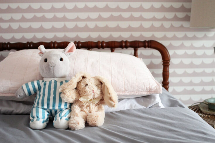
This light shade of mauve is another great option. It leans slightly purple but without being bright at all!

Get paint samples!
Samplize will send you 12"x12" peel and stick samples of paint colors from many popular brands so you can see exactly how they will look in your home!
Love paint colors? Be sure to check out:
- The Paint Color Formula - my complete guide to picking paint colors!
- My guide to paint sheens
- My guide to paint undertones
Painting for the first time? Check out my video tutorial on the easiest & cleanest way to open a paint can!

Looking for something?
We've been doing this since 2012 so we have a LOT of blog posts!
Search stuff like: Ceiling Projects | DIY Plant Stands | Thrift Flips

Hello, I'm Morgan, half of the creative force behind CharlestonCrafted.com! With a passion for DIY that dates back to 2012, I've transformed three homes and now I'm dedicated to helping others craft their dream spaces. Let's turn your house into a home together!