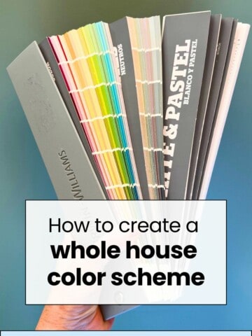
Looking for the best light blue paint color? Here are my favorite light blue paint colors and the details for each.
I love a light blue paint color. It can feel spa-like and relaxing, cool and refreshing.
As warm paint colors are all the rage, I have to plant my flag and pour one out for my very favorite shades of blue.
Whether you prefer cooler tones, are decorating a beach house, or just like the color blue, you really can't go wrong with a light blue paint color.
Here are my favorite light blue paint colors!

What is Sherwin Williams most popular light blue?
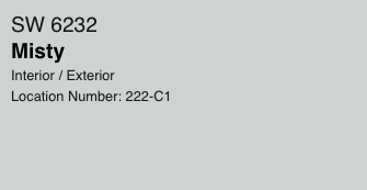
I recommend Misty as a light blue-gray paint color that will complement most homes! It is a super popular pale blue paint color with universally easy to decorate with neutral undertones.
Click here to read my full Misty paint review.
What accent colors pair the best with light blue?
Here are some of the best accent colors to pair with light blue:
- Crisp white
- Navy blue
- Black
- Gray that is either 2 shades lighter OR darker than the blue
- Pastel colors such as peach, blush, pale yellow, pastel green
- Cream or beige
In general, remember that most blue paint colors have cool undertones. So, they will most easily pair with other colors with cool undertones. Anything too golden or yellow will tend to clash.
Is light blue a warm or cool color?
Light blue is almost always a cool toned color, with blue and gray both typically having cool undertones. Read about undertones here!
Is there a warm blue color?
True blues are almost always cool toned. A blue with a warm undertone is going to lean more purple or lilac due to the extra red in the color, or a bit green due to the extra yellow!
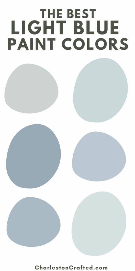
Light Blue Paint Colors
Here are my favorite light blue paint colors.
Windy Sky by Benjamin Moore (1639)
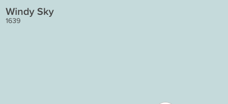
Windy Sky is a bright, cheerful shade of aqua. It has just a touch of gray to it to keep it from being too bright or overwhelming.
Click here to get a 12"x12" peel and stick sample of Benjamin Moore Windy Sky!
Iceberg by Benjamin Moore (2122-50)
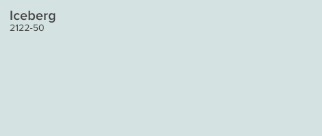
Iceberg is a baby blue with a touch of gray undertones. This gray gives the blue a muted feeling to keep it from reading as ultra pastel.
Click here to get a 12"x12" peel and stick sample of Benjamin Moore Iceberg!
Brittany Blue by Benjamin Moore (1633)
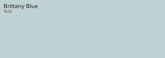
Brittany Blue is a sky blue paint color with a healthy amount of gray to it. The color is a bit darker than the super light blues for a bit more interest and depth.
Click here to get a 12"x12" peel and stick sample of Benjamin Moore Brittany Blue!
Icy by Sherwin Williams (SW6534)
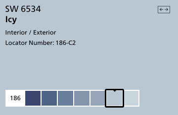
Icy is a very blue color with gray undertones. It is more of a "true blue" like a very light denim shade. Pairing it with warmer accents - like a cream or warm gray - will keep it from looking too blue.
Read my full review of SW Icy here!
Click here to get a 12"x12" peel and stick sample of Sherwin Williams Icy!
Lake Placid by Benjamin Moore (827)
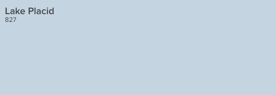
Lake Placid is a bright blue with a bit of purple to it. This is a great modern take if you like baby blue.
Click here to get a 12"x12" peel and stick sample of Benjamin Moore Lake Placid!
Upward by Sherwin Williams (SW 6239)
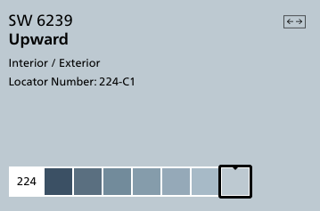
The color Upward is a bright and vivid shade of blue, without any dullness caused by gray undertones. However, the presence of these undertones does slightly reduce its overall brightness. Despite this, it still exudes a lively and optimistic vibe, making it an excellent choice for wall paint in various types of rooms.
Click here to get a 12"x12" peel and stick sample of Sherwin Williams Upward!
Whispering Spring by Benjamin Moore (2136-70)
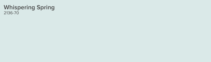
Whispering Spring feels a bit more aqua - and definitely cooler - than some of the other colors on this list. It is very light with a touch of gray, but a touch of green as well.
Click here to get a 12"x12" peel and stick sample of Benjamin Moore Whispering Spring!
North Star by Sherwin Williams (SW 6246)
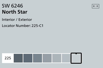
North Star is a cool, crisp blue-grey color. It has an icy appearance and pairs very nicely with a more charcoal gray.
Click here to get a 12"x12" peel and stick sample of Sherwin Williams North Star!
Manor Blue by Benjamin Moore (1627)
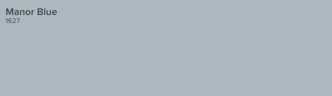
Manor blue is a bit more mid toned - not quite as light as some of these other options. But, in a very bright room, it will hold it's color and not feel washed out. There is a lot of gray to it, but plenty of blue, as well.
Click here to get a 12"x12" peel and stick sample of Benjamin Moore Manor Blue!
Windy Blue by Sherwin Williams (SW 6240)
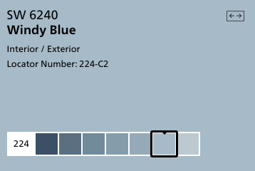
This is another light denim blue paint color. If you follow the color down the paint strip, you can see that it really is close to both charcoal and denim blue.
Click here to get a 12"x12" peel and stick sample of Sherwin Williams Windy Blue!
Gentle Gray by Benjamin Moore (1626)
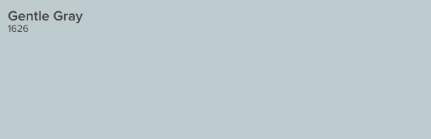
This shade is more gray than blue, but has definite blue undertones to it. It's a good option if you want a more neutral, mid toned light gray paint color.
Click here to get a 12"x12" peel and stick sample of Benjamin Moore Gentle Gray!
Looking for something?
We've been doing this since 2012 so we have a LOT of blog posts!
Search stuff like: Ceiling Projects | DIY Plant Stands | Thrift Flips

Hello, I'm Morgan, half of the creative force behind CharlestonCrafted.com! With a passion for DIY that dates back to 2012, I've transformed three homes and now I'm dedicated to helping others craft their dream spaces. Let's turn your house into a home together!