
Blue is a popular paint color and looks beautiful in most homes. Here are my favorite blue paint colors for cabinets!
Whether you are designing a kitchen or a bathroom, cabinet color is one thing that can date a space quickly. Luckily, it is also something that is easy and inexpensive to change.
If you are looking for a neutral paint color that is dramatic and modern – blue could be perfect for you.
I especially like a blue kitchen island paired with lighter or wood toned cabinets.
But, there are so many shades of blue! How do you pick one? Let’s talk about the best blue cabinet paint.
Be sure to read about the best paint finishes for cabinets here!
Is Blue a Good Color For Kitchen Cabinets?
I love blue colors for kitchen cabinets! Kitchen cabinets painted blue are a great way to infuse personality and color into your kitchen – especially with neutral other choices. In most cases, a more muted shade of blue will be best to keep it from looking overwhelmingly bright.
What Colors Go With Blue Cabinets?
Blue in general pairs nicely with most other colors. Layer it with cool toned colors for more of a cottage or coastal look. Or, pair it with warmer tones for a cozier, homey vibe.
Blue kitchen cabinet paint looks great with:
- White
- Lighter colors
- Natural wood tones
- Gold + metallics
Here are my favorite green paint colors for cabinets!
How to pick the best blue kitchen cabinet paint color
There are few things to consider when selecting a paint color for your cabinets.
First is to pick a color family. Congrats – if you are here, it seems like you picked blue 🙂
Then, think about colors within that family. Do you want something lighter or darker? Brighter or more muted? What undertones do you want?
Next, you want to get paint samples. I suggest buying at least three paint samples if you want to paint walls. Paint them on your walls in at LEAST three different spots each.
You want to make sure you have test spots near anything that is not changing, such as trim, carpet or flooring, or cabinets.
Now, let that dry (do 2 coats if it needs it) and then look at it over the course of at least 2 days. Look at it in morning, day, and evening light. Look at it with the lights on and the lights off.
All of these things effect how a blue painted kitchen cabinets look in your home!
See my favorite light blue paint colors here!
Blue paint undertones
Blue paint colors have either warm or cool undertones.
A warm blue color will be a blue-purple.
A cool blue color will be a blue-green.
In general whether you want a blue purple or a blue green, I always recommend a blue paint color with gray undertones. This makes the color more muted and not at all bright or neon!
See all of my favorite cabinet paint colors!
The best cabinet paint colors
The best white cabinet paint colors
The best black cabinet paint colors
The best gray cabinet paint colors
The best blue cabinet paint colors
The best green cabinet paint colors
I am excited to break down some of the most popular blue cabinet paint colors with you.
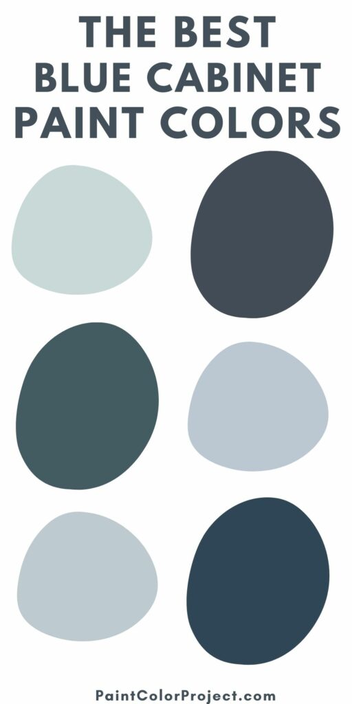

The Best Blue Paint Colors for Cabinets
There are tons of options for blue cabinet colors. Here are some favorites!
The best light blue cabinet paint colors
Windy Sky by Benjamin Moore (1639)


Windy sky is a gorgeous, bright and cheerful blue gray paint color. To me, it feels like aqua, all grown up and sophisticated. It feels like a sunny, cloudless day and would really make your home feel warm and inviting.
Click here to get a 12″x12″ peel and stick sample of Benjamin Moore Windy Sky!
Iceberg by Benjamin Moore (2122-50)


Iceberg is a very light blue with strong gray undertones. It is almost a baby blue – but muted up with all that gray so there is nothing pastel about it at all. Iceberg is neutral enough to cover every wall in your entire home and still look interesting.
Click here to get a 12″x12″ peel and stick sample of Benjamin Moore Iceberg!
Brittany Blue by Benjamin Moore (1633)
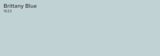
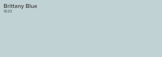
Brittany blue is a light, crisp, cool blue gray color. It has icey undertones but is decidedly blue. It is almost a sky blue, but with those gray tones that keep it from looking too UNC-Chapel Hill.
Click here to get a 12″x12″ peel and stick sample of Benjamin Moore Brittany Blue!
Icy by Sherwin Williams (SW6534)
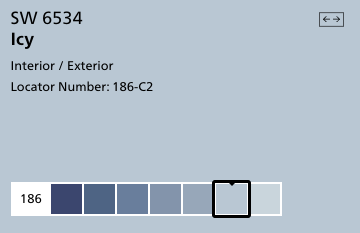

Icy is a very blue color with gray undertones. It is close to a sky blue color and one of the truest blues on this list. Pair it with creamy colors instead of whites or grays to keep it from looking too blue.
Read my full review of SW Icy here!
Click here to get a 12″x12″ peel and stick sample of Sherwin Williams Icy!
Lake Placid by Benjamin Moore (827)


Lake Placid is a bright, purple-y blue color. It is cool and icy while still maintaining a lot of blue pigment. It is a great modern take on baby blue.
Click here to get a 12″x12″ peel and stick sample of Benjamin Moore Lake Placid!
Upward by Sherwin Williams (SW 6239)

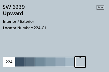
Upward is a clear and pure blue color. It doesn’t get muddy tones from the gray undertones but feels less bright because of them. It is a really cheerful color and would work well on walls in many rooms.
Click here to get a 12″x12″ peel and stick sample of Sherwin Williams Upward!
The best navy blue cabinet paint colors
Hale Navy by Benjamin Moore (HC-154)
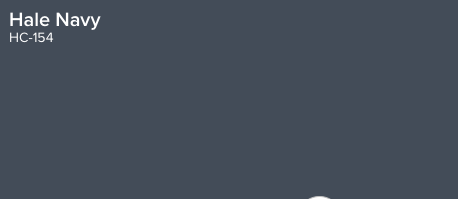
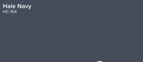
Hale Navy is a deeply saturated navy blue. Using this color will bring a ton of impact into your space!
It might not be the color for all of the walls in your home, but using it selectively can be really beautiful. The gray undertones keep this blue from looking too much like a military uniform.
Read all about Hale Navy and see it in several different rooms and applications here!
Click here to get a 12″x12″ peel and stick sample of Benjamin Moore Hale Navy!
Stained Glass by Benjamin Moore (CSP-685)


Stained Glass is really a dark teal color, but it has been muted by gray undertones. While teal can be really overwhelming to imagine on the walls, the muddiness of Stained Glass makes it really cozy and comfortable, especially in a light and bright space.
Click here to get a 12″x12″ peel and stick sample of Benjamin Moore Stained Glass!
Blue Note by Benjamin Moore (2129-30)


Blue Note is a deep navy with an almost sea-like aesthetic. There feels like there are green tones deep within the muted blue. It is a pure, deep blue color, but there are definite gray undertones keeping it from feeling too blue.
Click here to get a 12″x12″ peel and stick sample of Benjamin Moore Blue Note!
New Providence Navy by Benjamin Moore (1651)


In contrast, you can see the real teal and green undertones in New Providence Navy.
Click here to get a 12″x12″ peel and stick sample of Benjamin Moore New Providence Navy!
Polo Blue by Benjamin Moore (2062-10)


Polo Blue is a rich, masculine, true navy color. It is very dark and moody and will make a big impact in any space. It’s also a gorgeous choice for exterior siding for a home.
Click here to get a 12″x12″ peel and stick sample of Benjamin Moore Polo Blue!
Gentleman’s Gray by Benjamin Moore (2062-20)


Gentleman’s gray is really an odd name for this color because it’s not nearly as gray as it is a deep teal. However, the gentleman’s bit is right on key – this would be gorgeous in a study, library, or man cave paired with masculine accessories.
Click here to get a 12″x12″ peel and stick sample of Benjamin Moore Gentleman’s Gray!
What do you think are the best blue paint colors for cabinets?


Looking for something?
We’ve been doing this since 2012 so we have a LOT of blog posts!
Search stuff like: Ceiling Projects | DIY Plant Stands | Thrift Flips


Hello, I’m Morgan, half of the creative force behind CharlestonCrafted.com! With a passion for DIY that dates back to 2012, I’ve transformed three homes and now I’m dedicated to helping others craft their dream spaces. Let’s turn your house into a home together!