
Love the paint color Brooklyn by Behr? Here is everything that you need to know about it!
Hey y’all! Today I am excited to share a new monthly blog series for 2019 – the paint color of the month! Each month I will share a paint color that is currently inspiring me and help you decide how you could use it in your home.
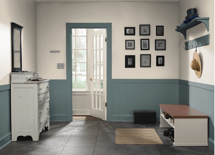
The color of the month this month is Brooklyn by Behr! N440-6 is the paint color code for this color.
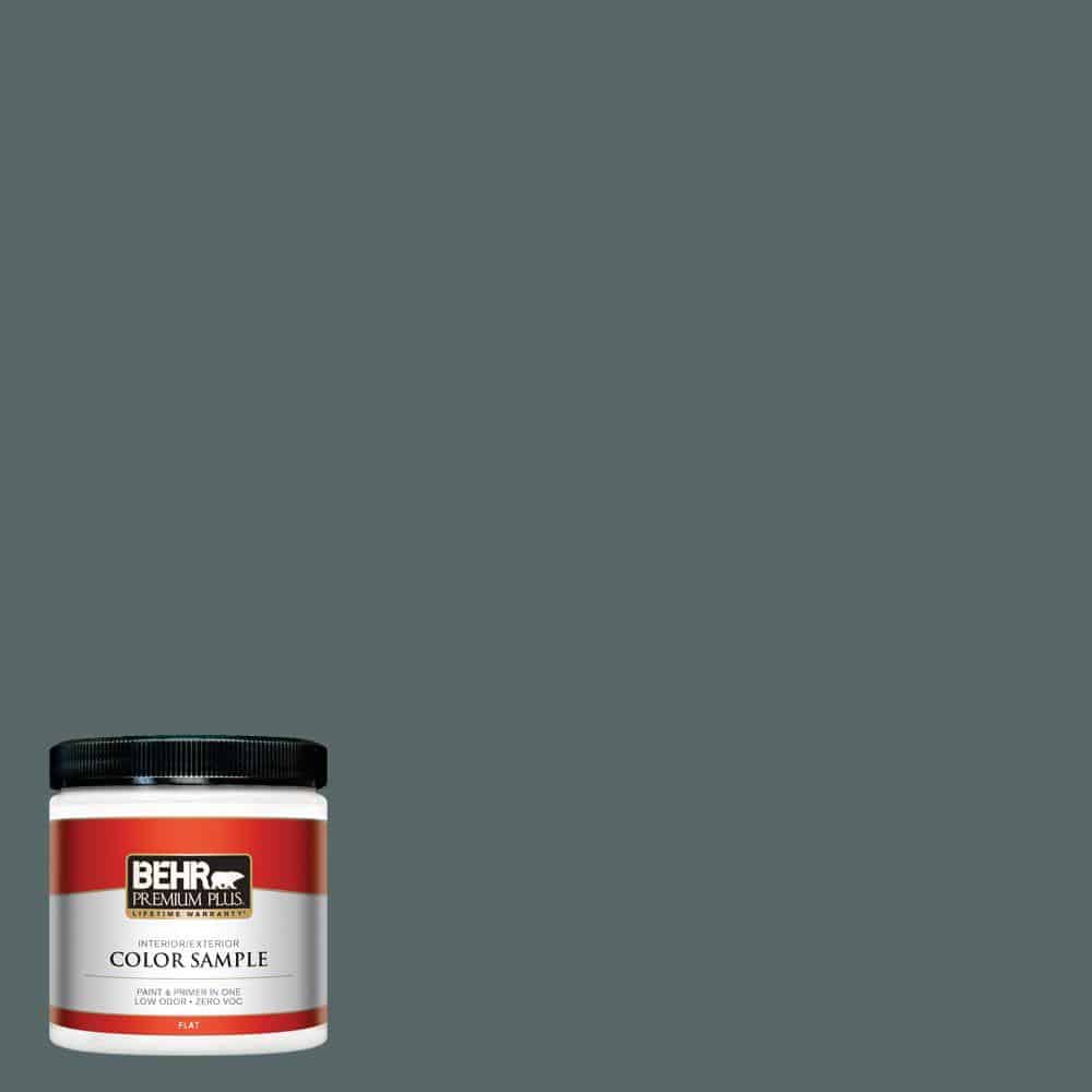
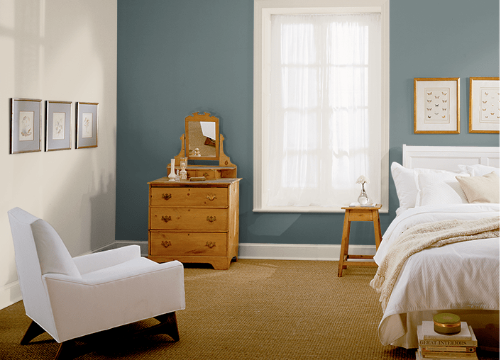
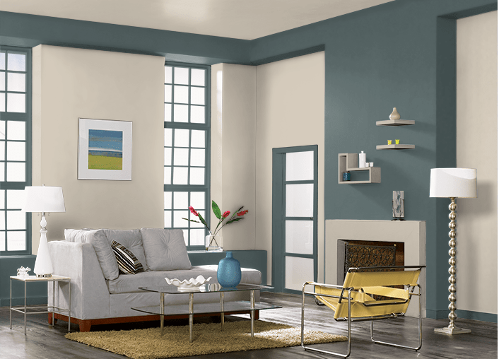
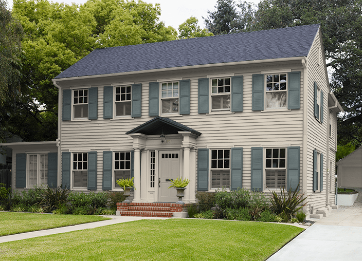
All images in this post are from the Behr “preview this color in a room” tool.
What I like about Behr Brooklyn
I am really feeling dark moody greens at the moment. Brooklyn is a deep green with a lot of gray undertones. These undertones make it feel muted despite how dark it is. It’s not at all bright or overwhelming.
This green color really makes me think of fresh plants. It has an outdoorsy and natural feel to it that pairs really well with neutrals and shades of wood. Brooklyn could work with a natural pine or a dark stained walnut – or anything in between!
Best Uses for Behr Brooklyn
I would love to use Brooklyn as an accent color in a room. While it could work for all the walls of a space, it would be easier to pull off in smaller quantities. The beauty in this color is in the contrast, so it needs other colors of varying shades to really make it pop.
It would look great as:
- An accent wall
- The ceiling – especially if it came 18-24″ down the wall, too!
- A large piece of vintage furniture
- Doors or window frames in a white room
- Shutters on a light colored home
- Accent molding in a light colored room
- A kitchen island with light or dark counter tops
Coordinating Colors for Behr Brooklyn
Brooklyn pairs really nicely with a creamy white, deep navy, or warm mustard color. Neutral colors are going to let the greens of Brooklyn really pop. A brighter color, like the neutral or an aqua, will actually allow Brooklyn to fade into more of a neutral shade itself, playing off of those grey undertones.
70’s colors seem to really be making a comeback right now. Mustard and coral are two examples of this, and both pair really well with this green shade, Brooklyn.
My favorite coordinating Behr paint colors are:
- Tumeric M290-7
- Bakery Box BL-W09
- Dark Navy S530-7
- Dragonfly PPU12-03
Brooklyn can pair with a lot of different finishes, as well. A light, metallic finish like nickel or brass would really pop against the deeper green. It would also look great with black fixtures – the contrast between the two could read as really modern and beautiful.
I love Behr’s Brooklyn paint color and think that it would really work fabulously in a lot of different applications. I have to figure out a way to get it into my home!
Ready to get started painting? Be sure to check out our tutorial on how to open a paint can without making a mess!
Would you use Brooklyn paint color in your home?
| |
|||
| |
|
|
|


Hey there, I’m Sean, the woodworking enthusiast and builder behind CharlestonCrafted.com! Since 2012, I’ve been sharing the magic of turning raw materials into beautiful creations. I love teaching others the art and satisfaction of woodworking and DIY. I try to inspire fellow crafters to make something extraordinary out of nothing at all.
Joe
Wednesday 26th of June 2019
what is the name of the wall color you paired with the Brooklyn trim and feature walls?
Morgan
Wednesday 26th of June 2019
That's actually not a paint color but the default blank in the Behr color visualizer you can see it here - https://www.behr.com/consumer/colors/paint/visualizer Sorry for the confusion!!